
TMS Studios
Brand identity standards manual
TMS Studios is a fictional printmaking business based in Austin, Texas. The brand identity manual was created for a university design course to focus on the conceptual development of a brand identity while working collaboratively with a client.
CHALLENGE
The client had the idea for the business, a welcoming printmaking and design studio. I designed a cohesive brand logo and identity system that communicates the goals and attributes of the business.
CLIENT INTERVIEW
To gain a clear basis on which to develop the brand, I interviewed the client with thorough questions about their brand.
INTERVIEW EXERPTS
What are the values of the company?
Have good service as well as be welcoming, helpful, and accommodating
What is the goal of the company?
Make a stress free service for the client and help strengthen the Houston community
What should the business be communicating?
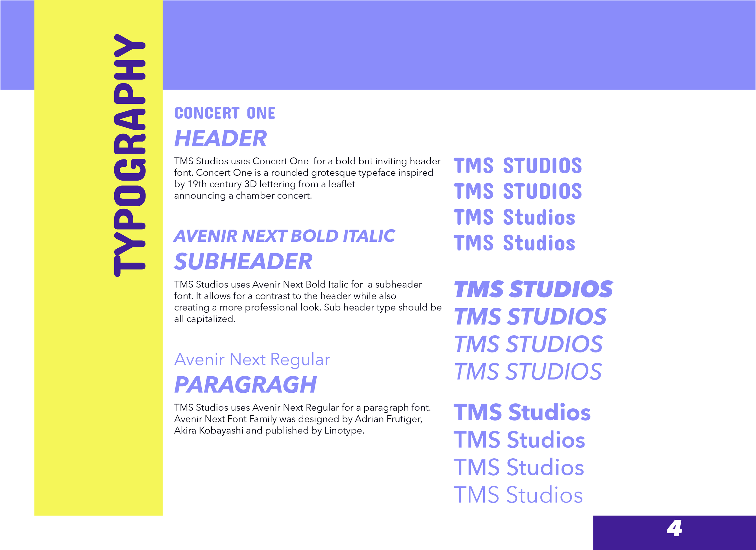
Communicating through typography and fonts. Communicate hard work, a stress Free process, and organization.
Who is current target audience?
Small-medium sized companies in the Houston area.
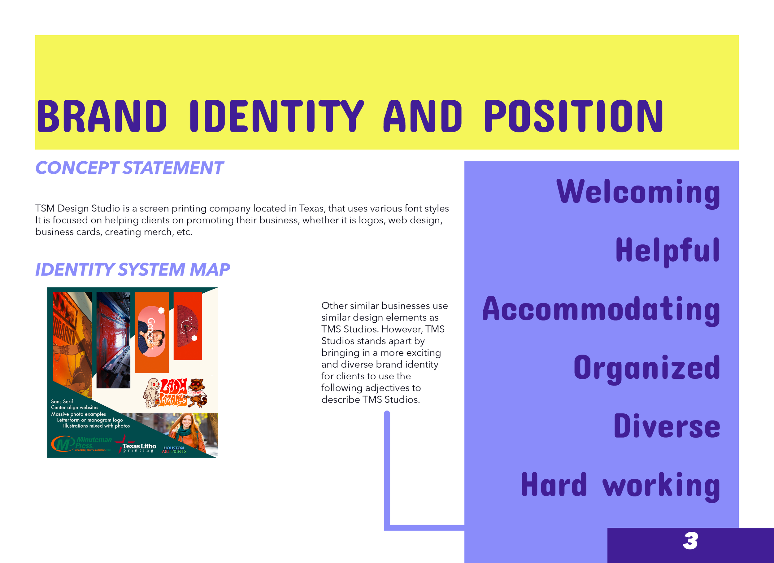
COMPETITOR ANALYSIS
I researched different similar companies to analyze what current branding others use to represent their brand.
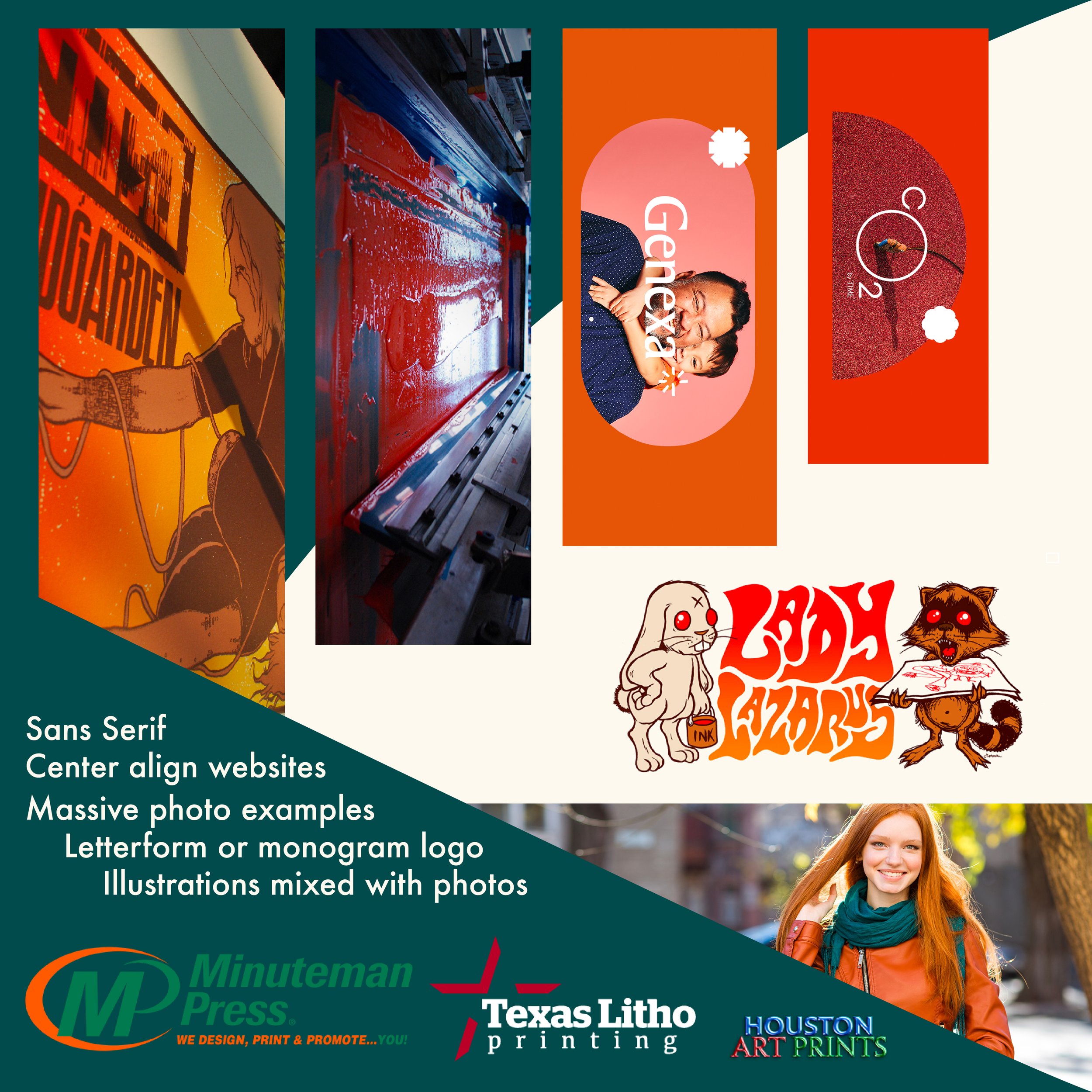
Similar businesses in the area I found often used red and green colors to communicate their branding.
San Serifs, letterform logos, and imagery were all common design choices present.
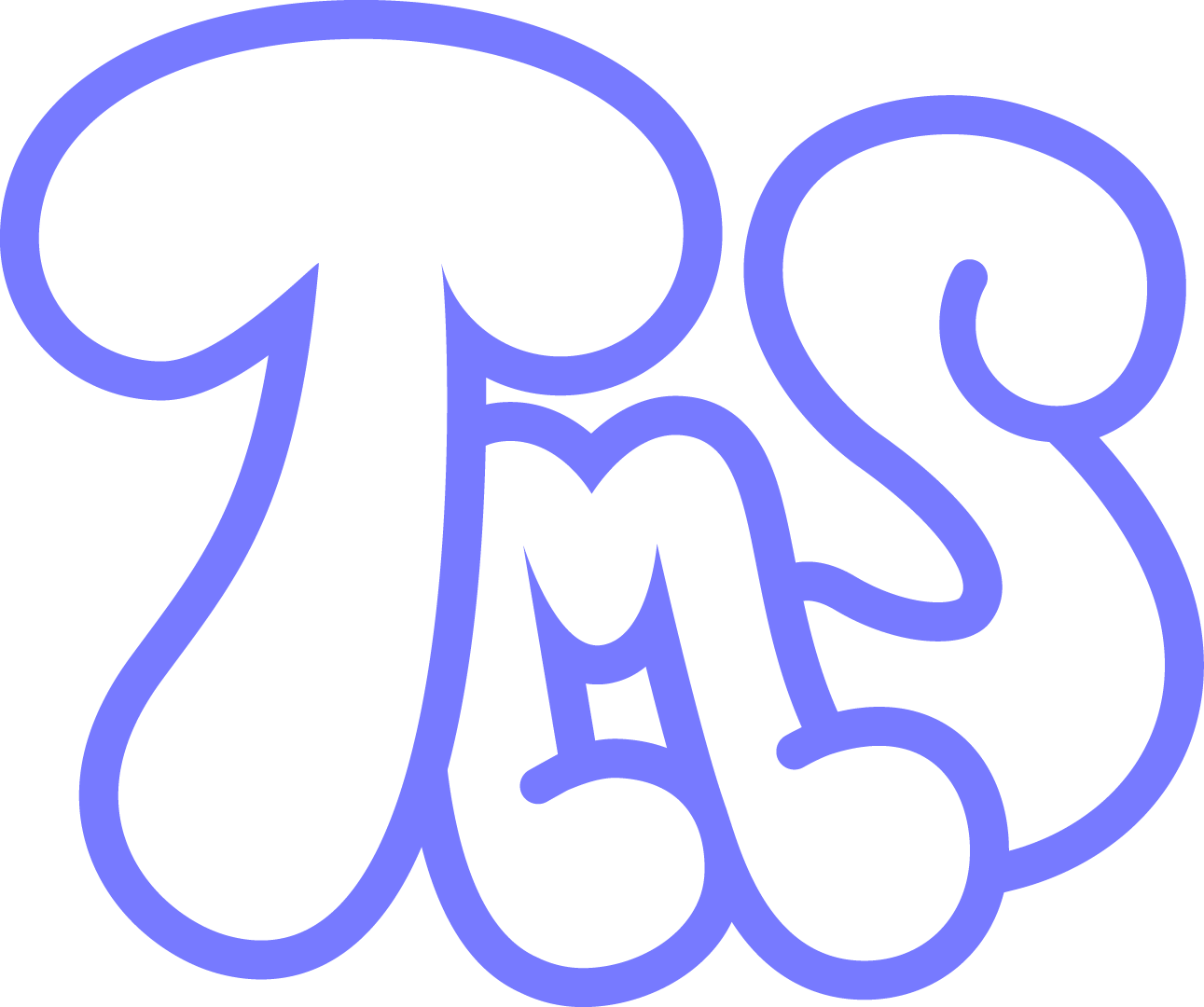
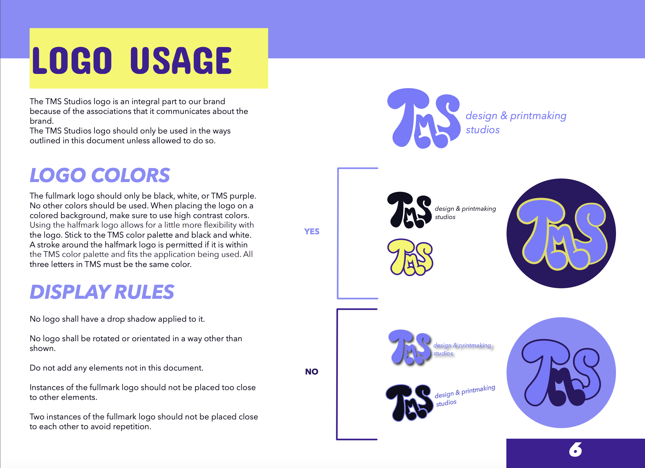
LOGO DEVELOPMENT
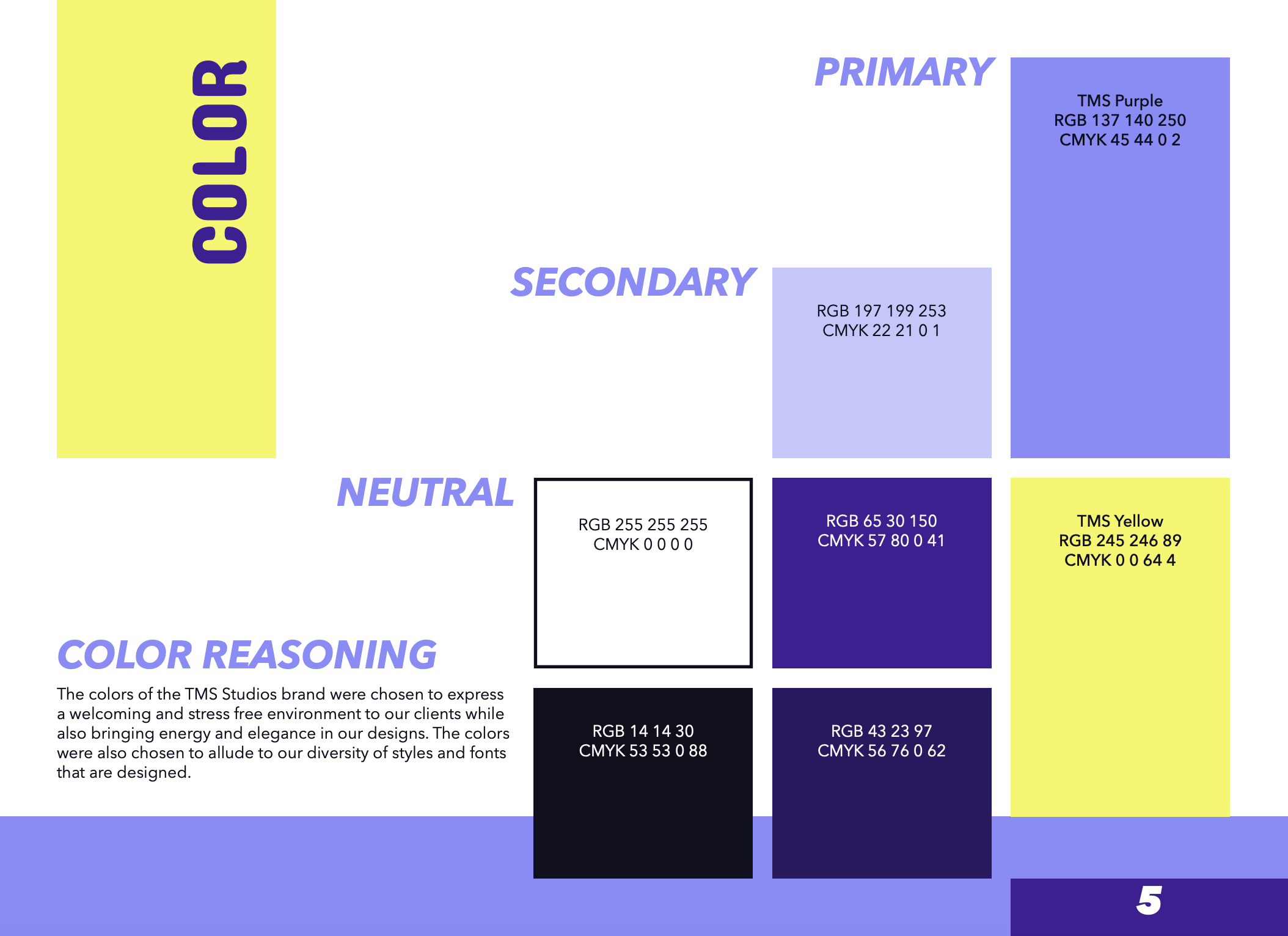
The client described valuing graffiti style bubbly fonts, and wanting to have a typographic logo to encapsulate the business. I worked closely with the client to develop initial iterations on the design. Along with this we decided on brand colors and type early on in the process to help progress the development.
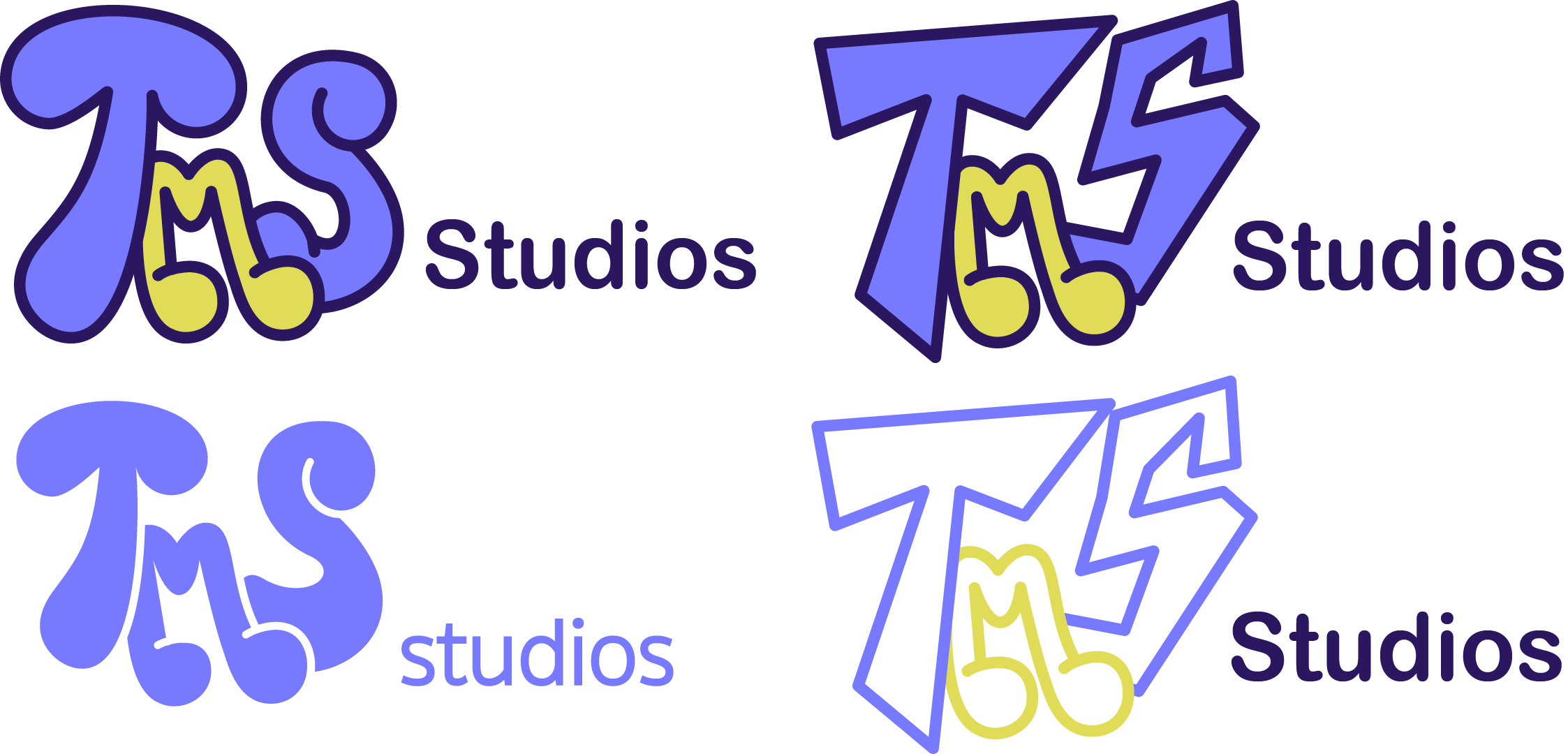
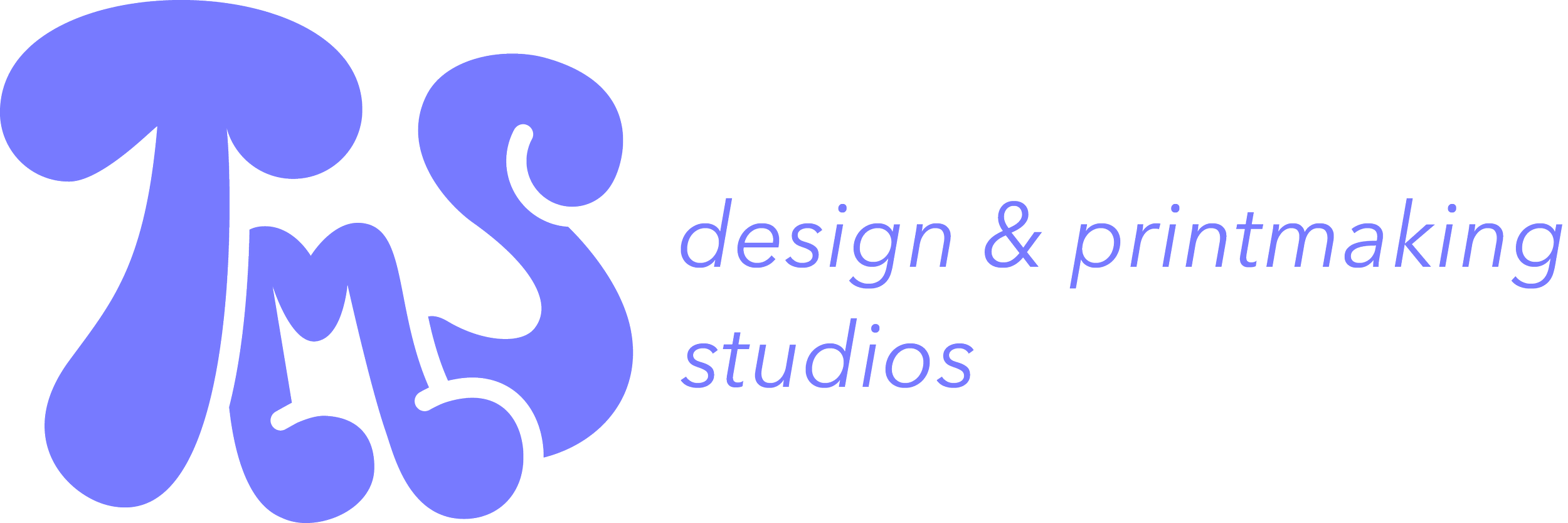
FINAL DESIGN
The final design communicates the welcoming and friendly values of the company, while also being unique and expressive. The colors were chosen to blend the client’s brand values of accommodation and organization.
BRAND EXPANSION
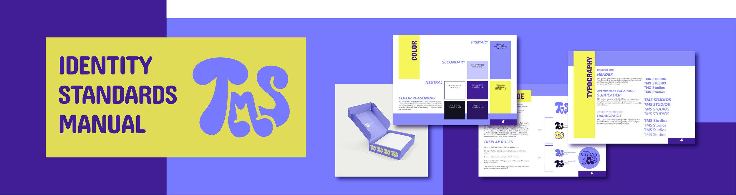
Once I gained a grasp of the basis of the brand, I began to work on expanding it into a full set of identity standards. This involved creating guidelines when working with the logo, colors, type, graphics, imagery, and tone of the brand.
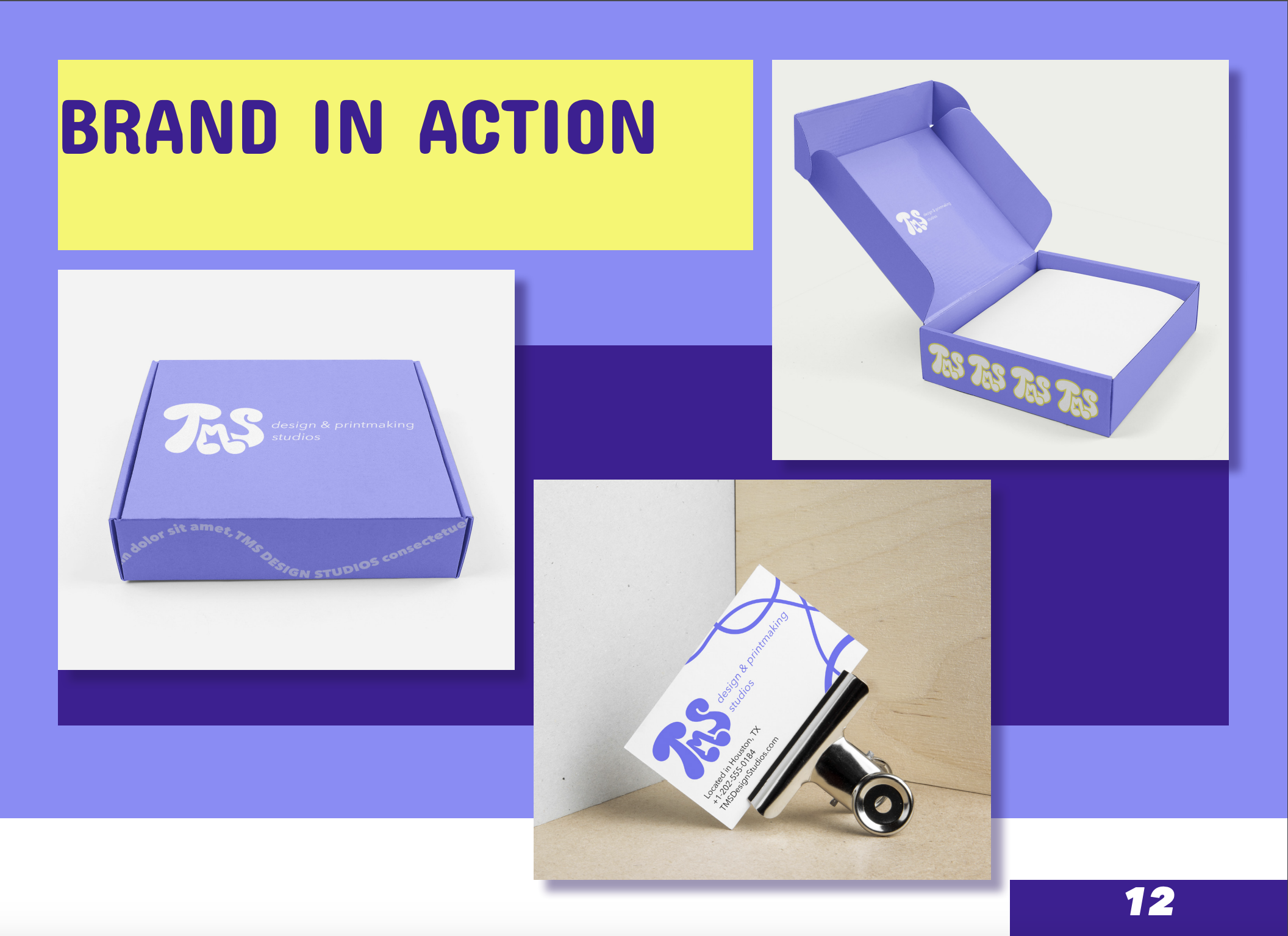
BRAND IN ACTION
Creating mockups of the brand working in action helped to visualize how the different elements work together to successfully communicate the ideals of the business.
REFLECTION
This project required me to balance what I felt worked best, my client’s needs, and what was possible in the time allowed. I learned to always tie my design decisions back to the client’s requests. I focused on making the work feel loose, organized, and stress free through curvy illustrations, bold boxes, a grid system, and welcoming language. Some choices had to be adjusted, like the header font and color use, to work effectively within the system and time limits. Overall, constant communication with my client made the process smooth and helped the project feel successful.