
Night & Day Bar & Cafe
Visual Identity System
Night & Day is a fictional café and bar concept created for a university course. The business transforms from a neighborhood café during the day into a bar at night, with the identity built around the contrast between the two experiences.
CHALLENGE
I created a full identity system for a fictional business from scratch. I built the ideas and assets myself to explore the full scope of the branding.
IDENTITY DEVELOPMENT
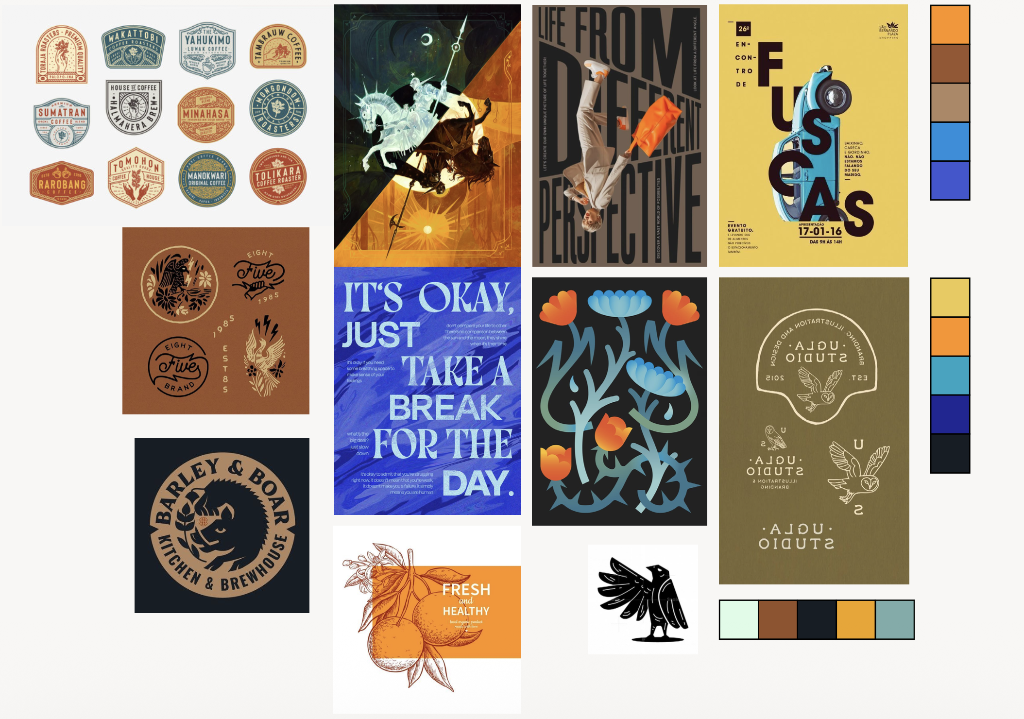
I began with a mood board to explore the themes of contrast. These references established the visual direction and guided every branding decision that followed.
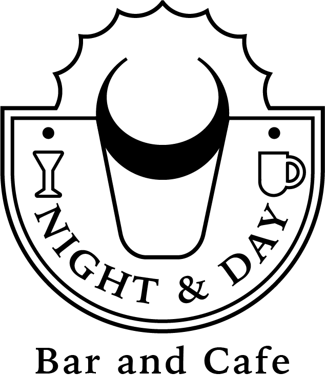
LOGO DESIGN
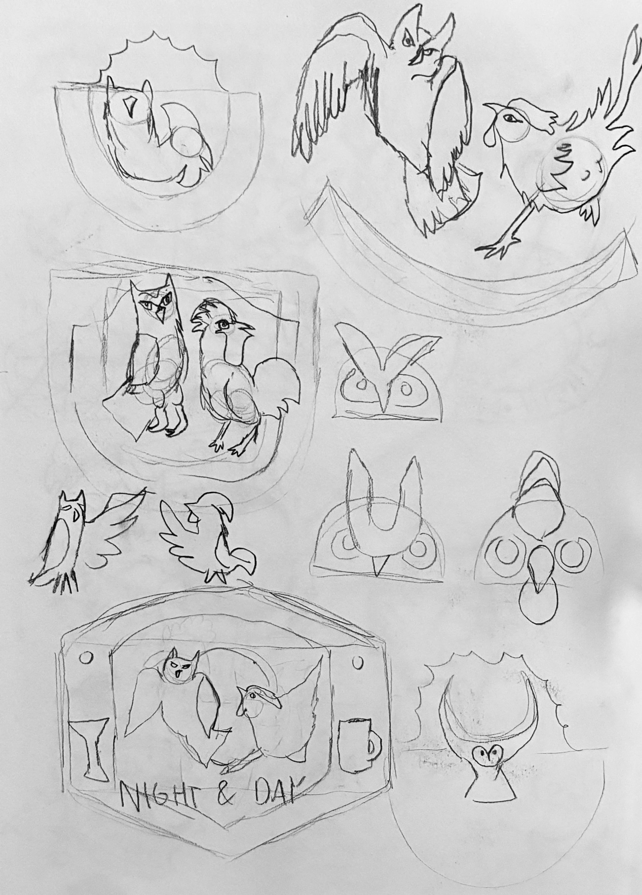
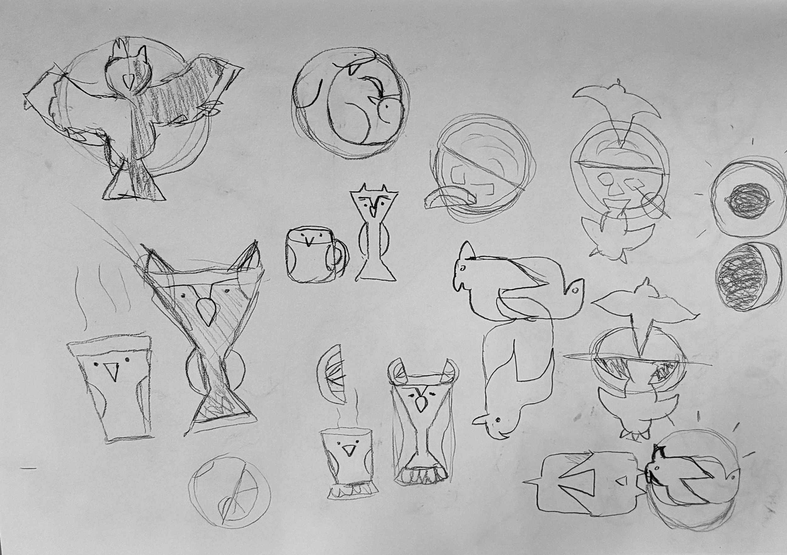
I had a thorough brainstorming and sketching process to explore different connections within the business.
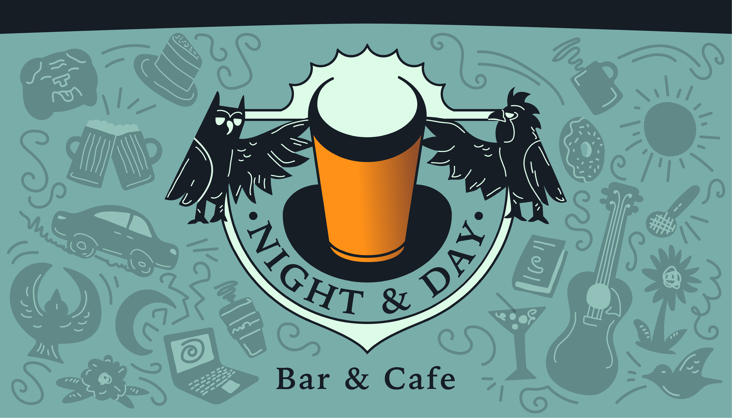
Sketches: I eventually landed on creating a seal logo with a rustic style. I implemented imagery that hints to the idea of duality and change between night and day.
I decided to make the early bird (chicken) and night owl the mascots of the brand, and so their inclusion drove the ideas of the logo sketches.
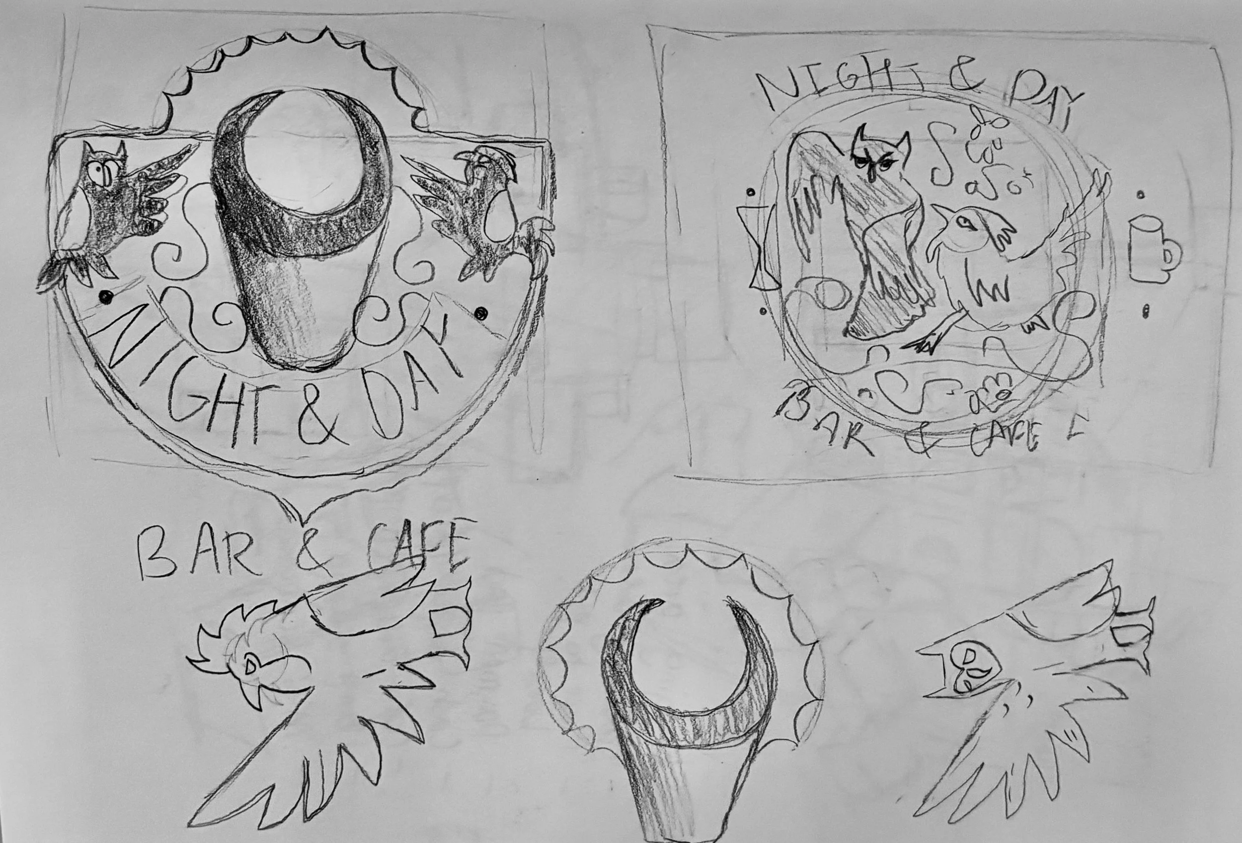
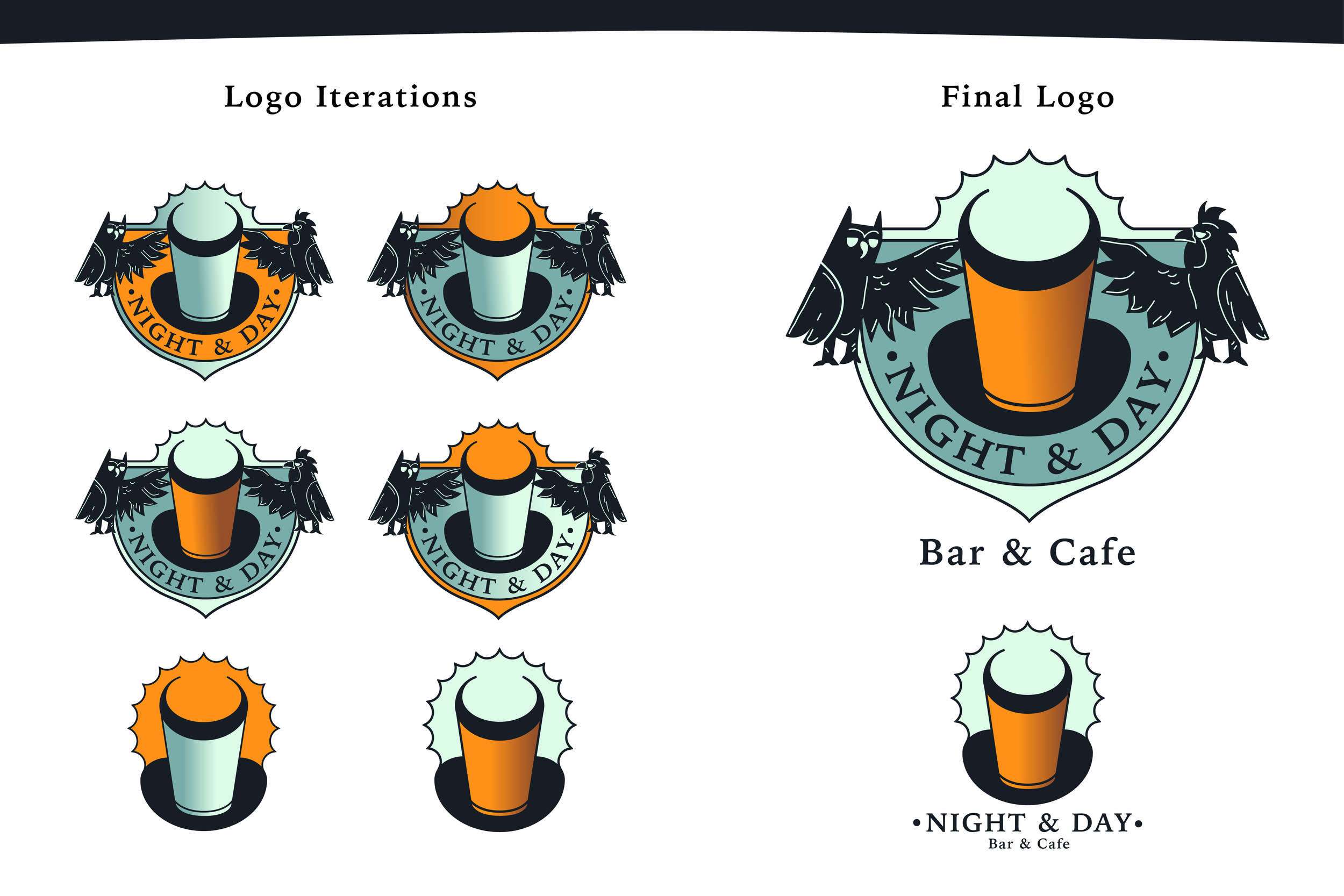
Development: Moving onto digital iterations, I focused on developing scale, colors, and composition of the logo. I added in the two bird illustrations and increased their scale to balance the logo.


Color and Finalizing: The colors of the brand feel inviting, energetic, and familiar. Keeping the themes of contrast and duality, I had the bright orange and muted green created the primary tension of the brand.
RESEARCH
I reflected on my own values and ideas to come up with the premise of the business. Once I had the idea I chose a physical space in the local Des Moines area to be the location for the business.
Competitor Analysis: Looking at similar locations around the Drake University area, my main competitors would be other local restaurants and entertainment businesses, as I would also like to host live music and other events to invite more guests.
The playhouse: Comedy
Xbk’s: Live music venue and bar
Mar’s cafe: Coffee shop and café
Drake diner: Local restaurant
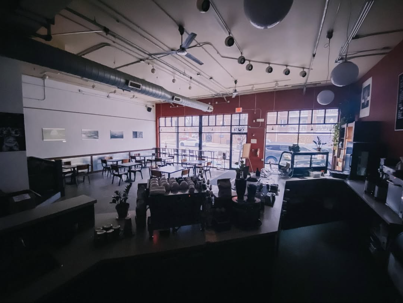
LOCATION
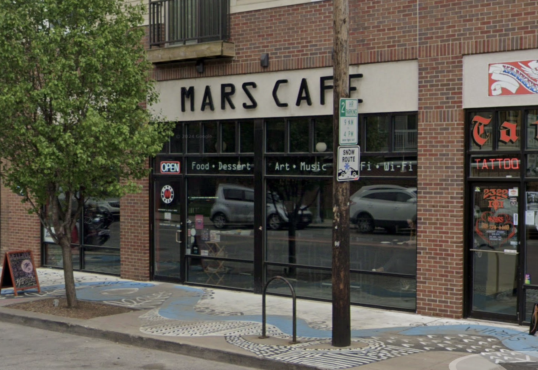
I chose to have the storefront be Mars Cafe in Dog Town because of its location, appeal, and internal structure. The large class siding makes it very inviting and brings in a lot of natural light, which would make it feel bright during the day and inviting to see from the outside at night.
EXPANDING THE BRAND
Using the ideas and themes created in the logo, I looked at the different ways that I could use the brand while also being functional with the designs of collateral.
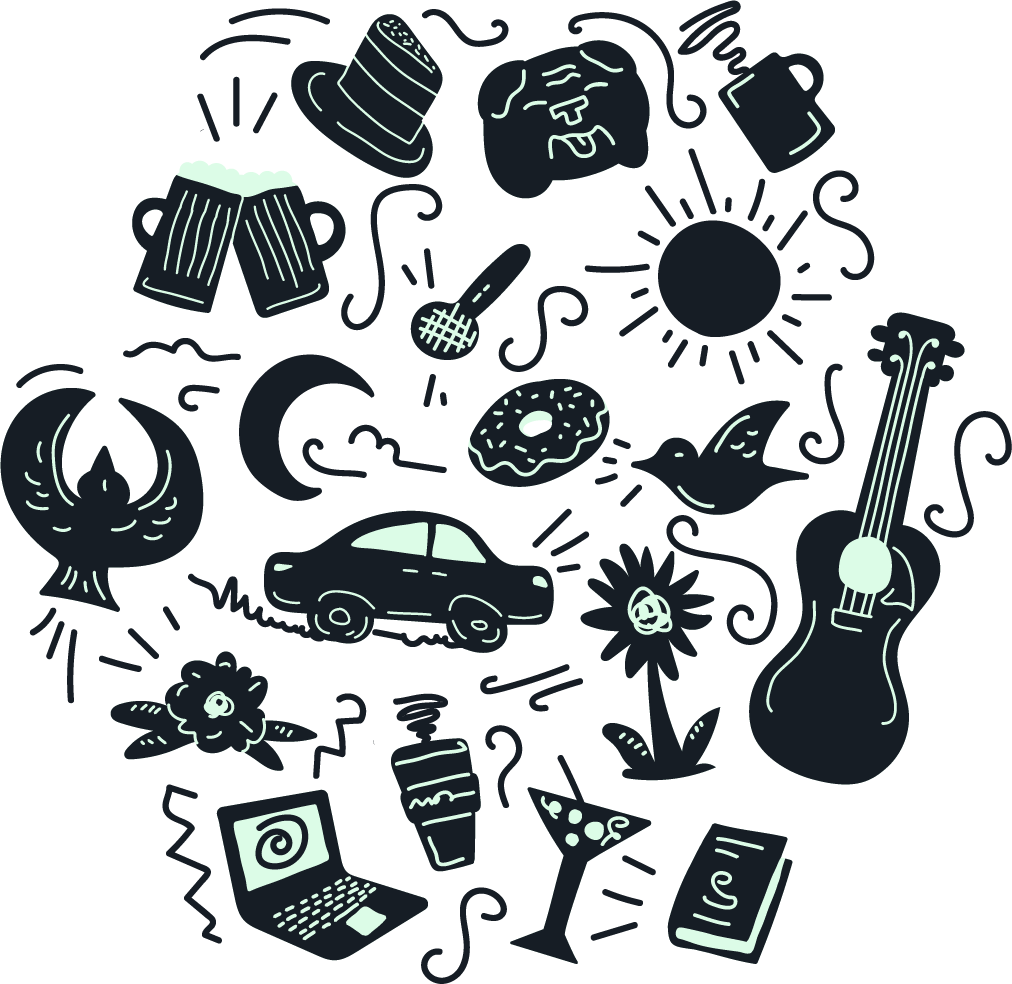
Illustrative pattern: I created this illustrated pattern to be used throughout different brand elements.
BRAND IN ACTION
I continued to expand the applications of the brand in a multitude of forms and styles, adhering to the principles I set out and ensuring that the brand Identity shines through.
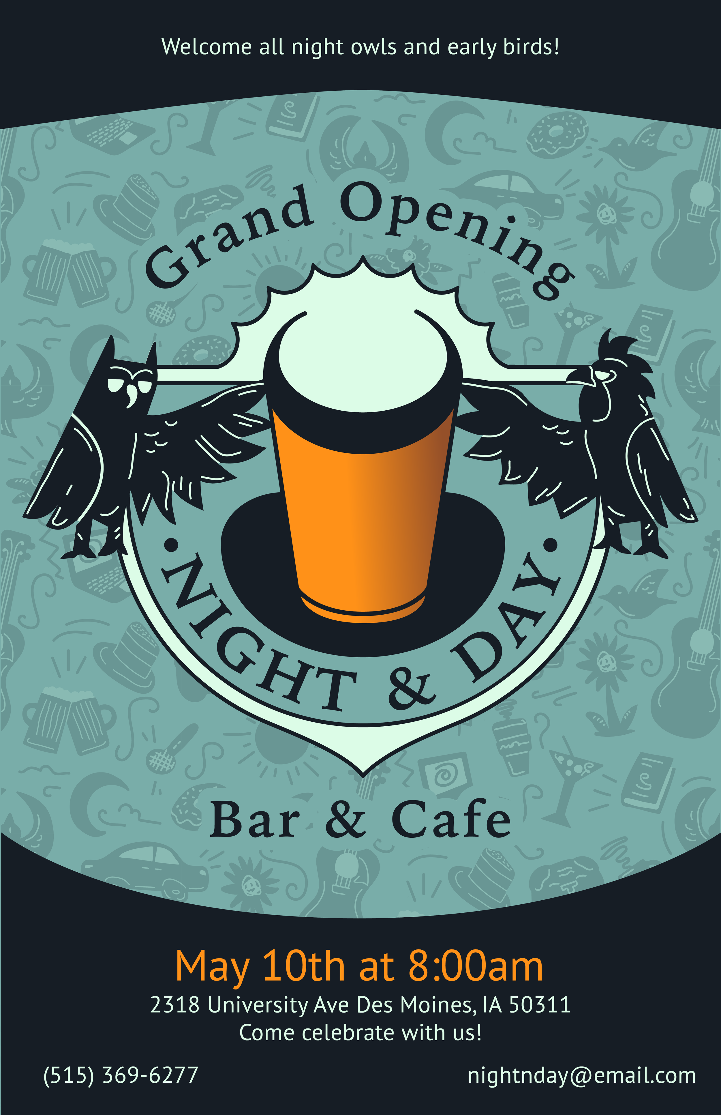
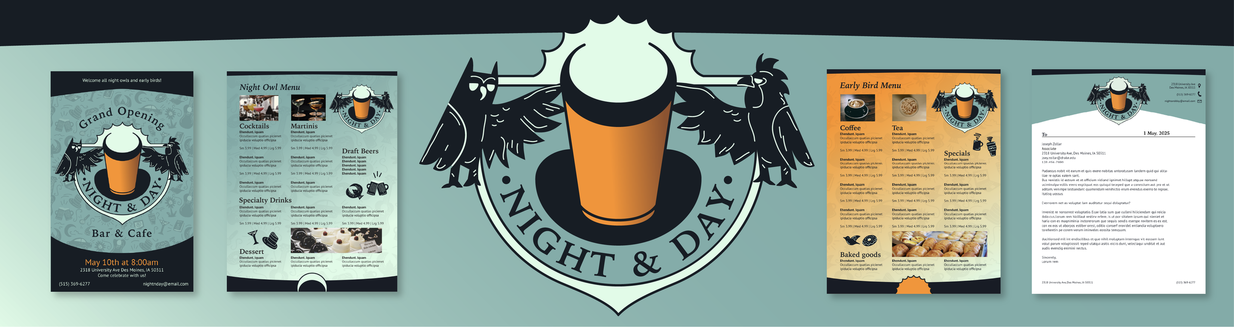
Grand opening poster
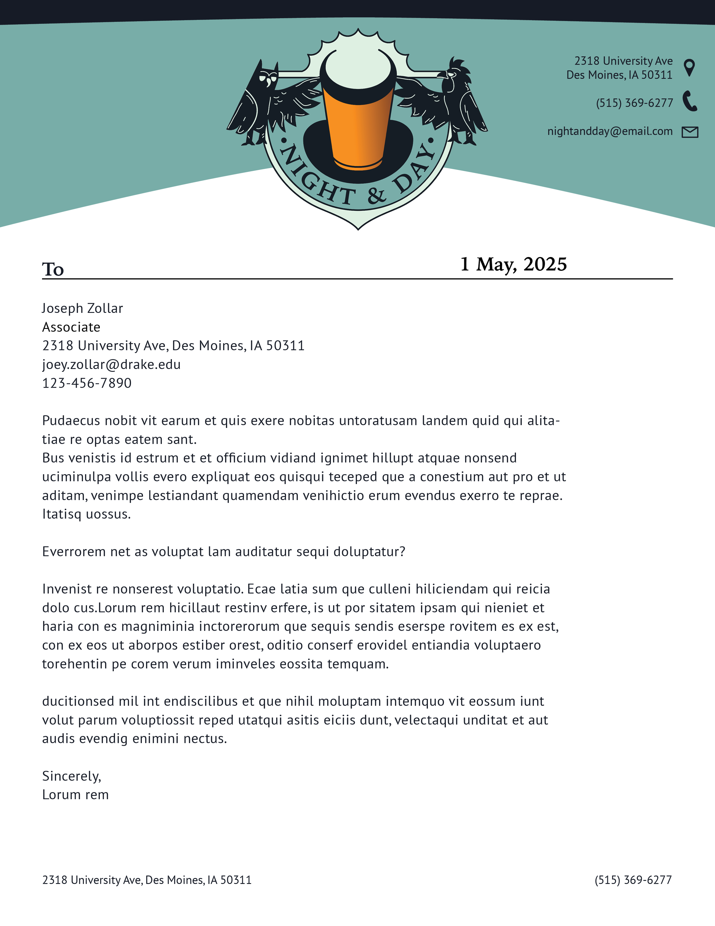
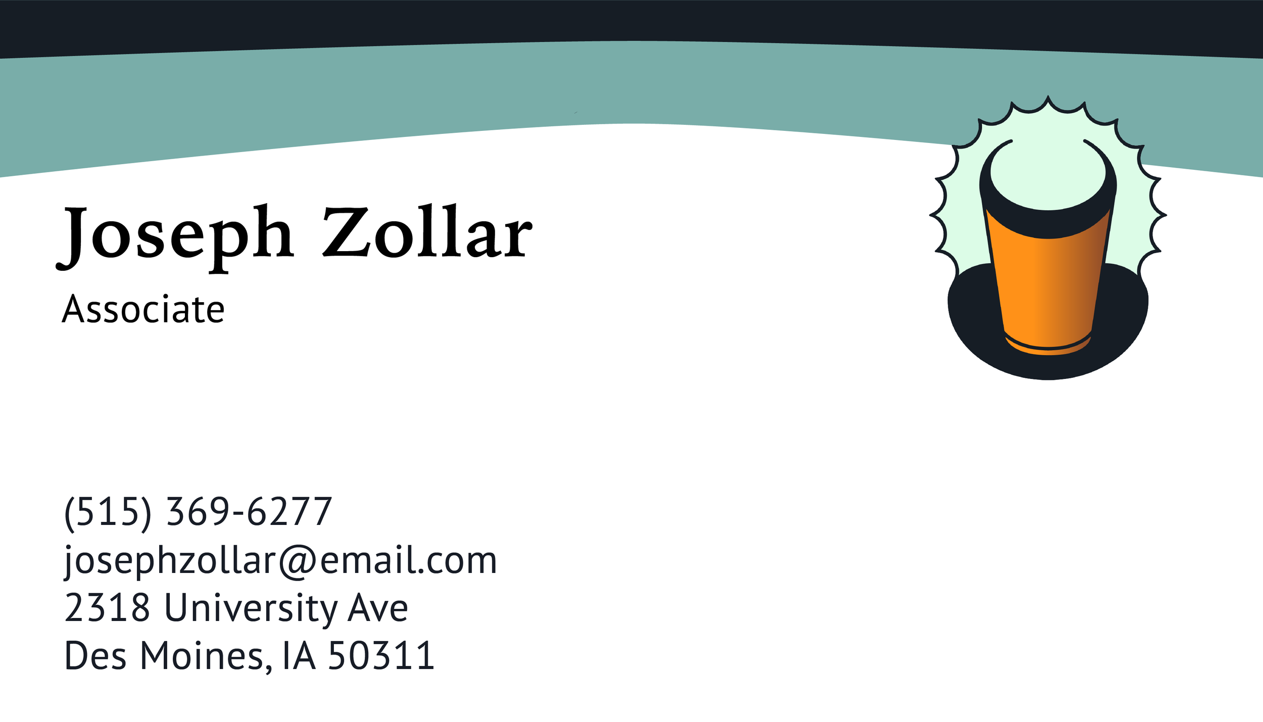
Letterhead template
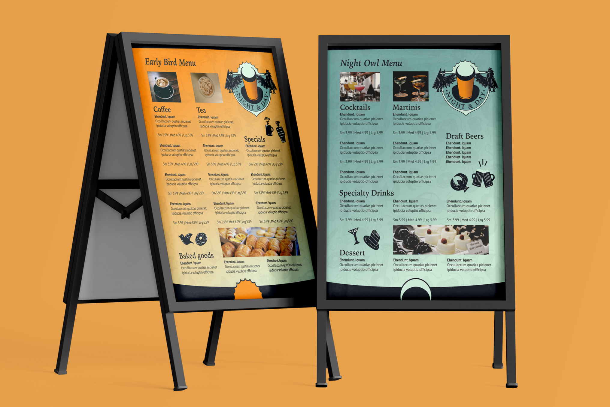
Daytime and nighttime menus
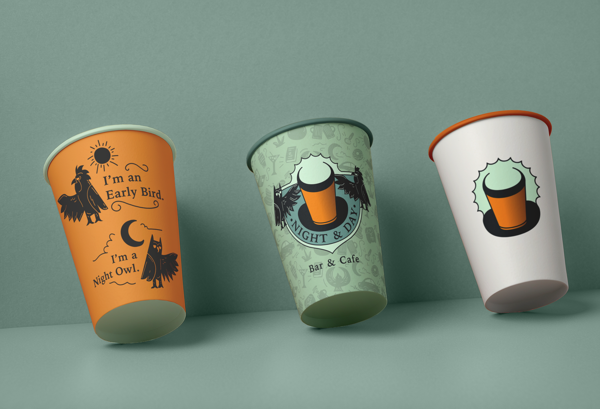
Cup design mockups
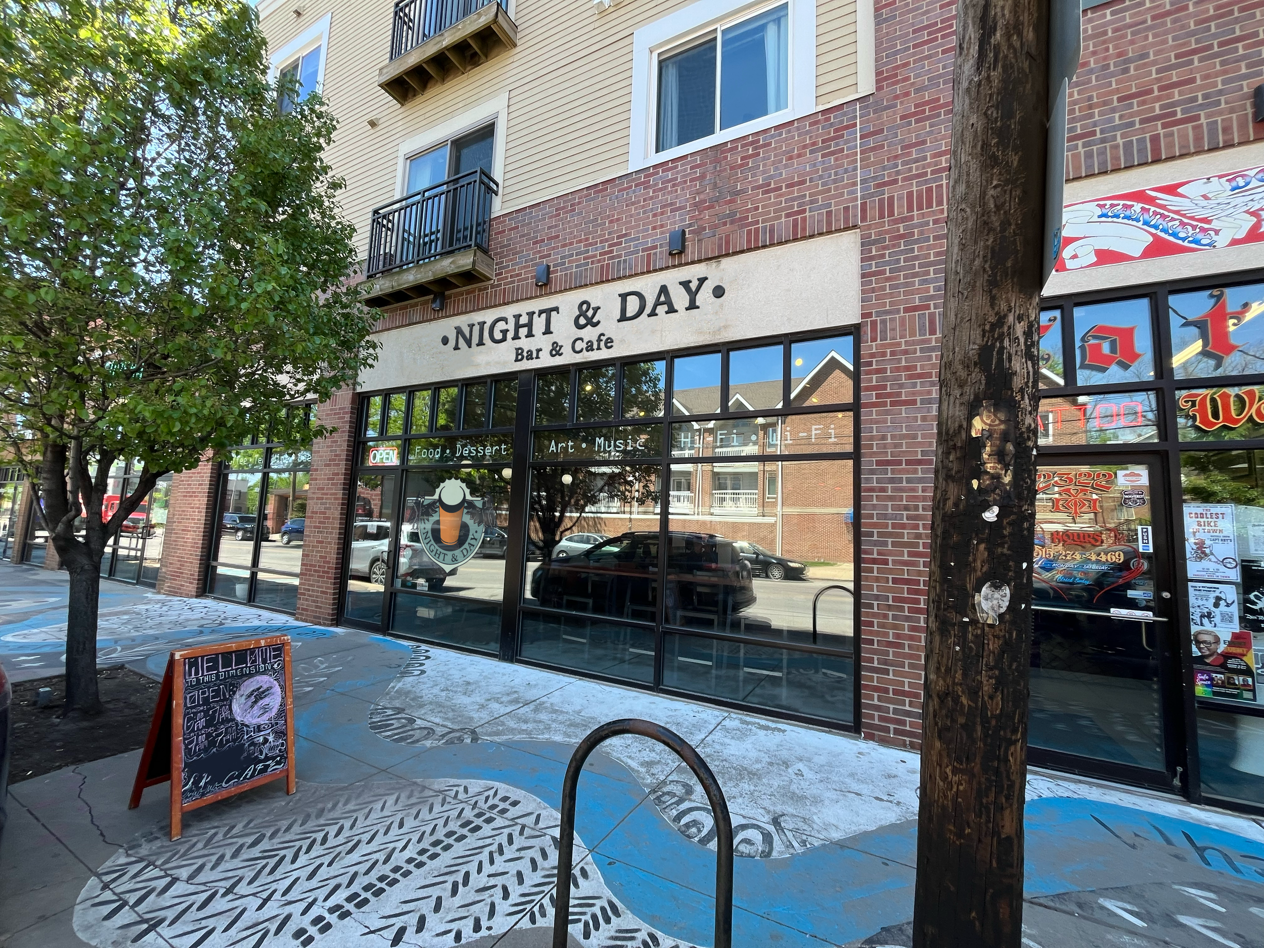
Storefront mockup
REFLECTION
This project was a very worthwhile and satisfying project to see come together, allowing me to visualize the business as a real place I would like to visit. It challenged me to combine all my design and research skills into one project, and I'm proud of the outcome.