
DUTOGETHER
Drake university student connection app
How can we make Drake University students feel more connected on campus? A group of students and I developed the idea and interface for a mobile application that seeks to solve the issues currently facing students at our university.
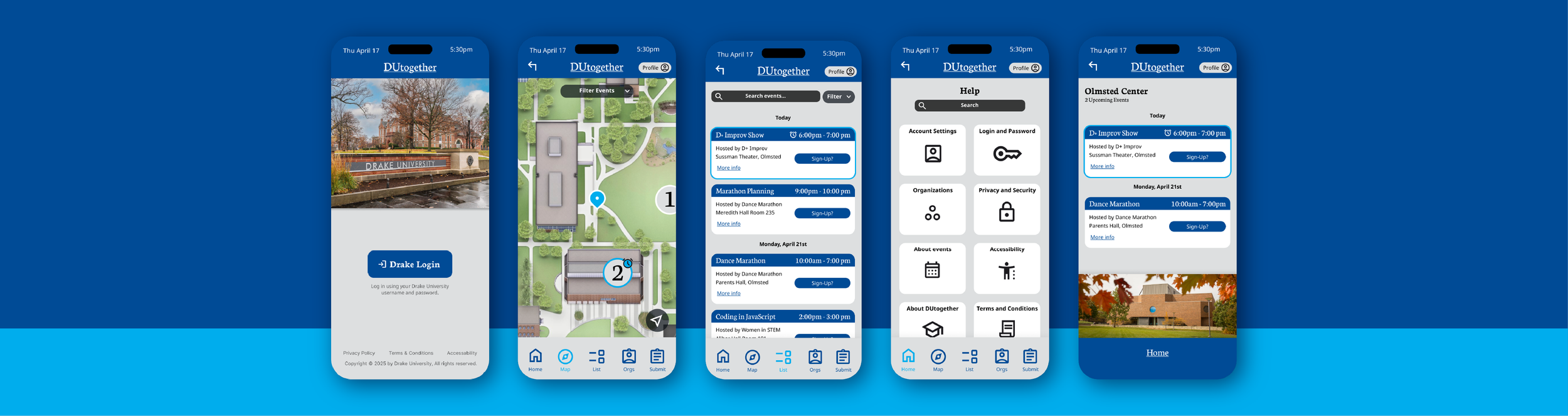
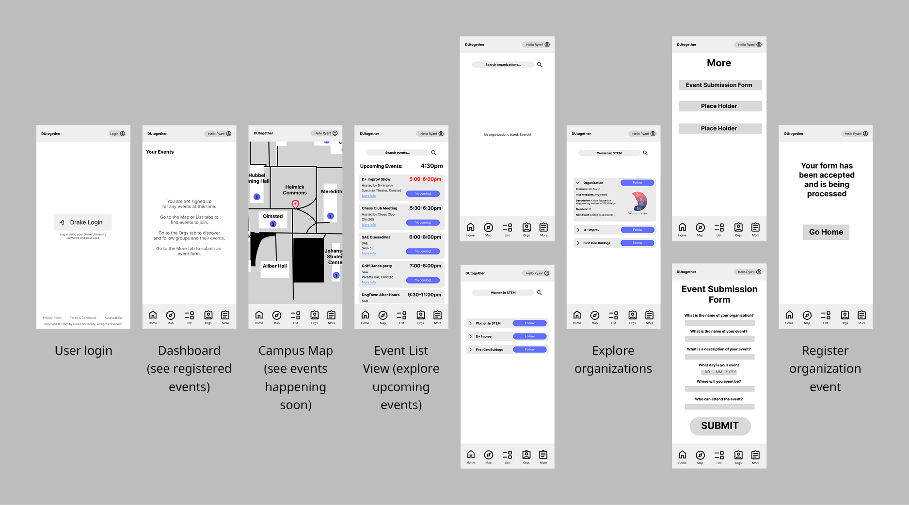
Map exploration:
Our explore map allows users to visualize Drake’s campus and see upcoming events for each building.
We ensured that times and relevance were apparent through multiple elements (such as color and icons) to communicate clearly to the user.
Event List:
Our event list allows users to also get an itemized list of upcoming events based on location and timing.
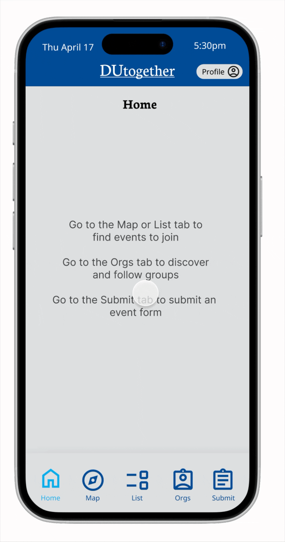
Events the user has registered for will appear on their home dashboard to allow them to keep track of their upcoming events.
CHALLENGE
The challenge of this project was to research and develop an application and interface based on the target audience, Drake University students, to solve their needs.
My role: I led different parts of research, app functionality development, and overall design decisions. I applied my design knowledge when applicable to push the project forward.
RESEARCH AND EMPATHIZING
We needed to empathize with and understand our target audience and who they are. The goal was to find expressed and latent needs our app could solve.
Target users:
Students: Students looking to participate in campus culture through events and
organizations.
Student organizations: RSOs looking for a better way to spread awareness about their
organization and events.
PERSONAS
Based on the data we gathered, we created two different personas to encapsulate the audience we want to develop the app for.
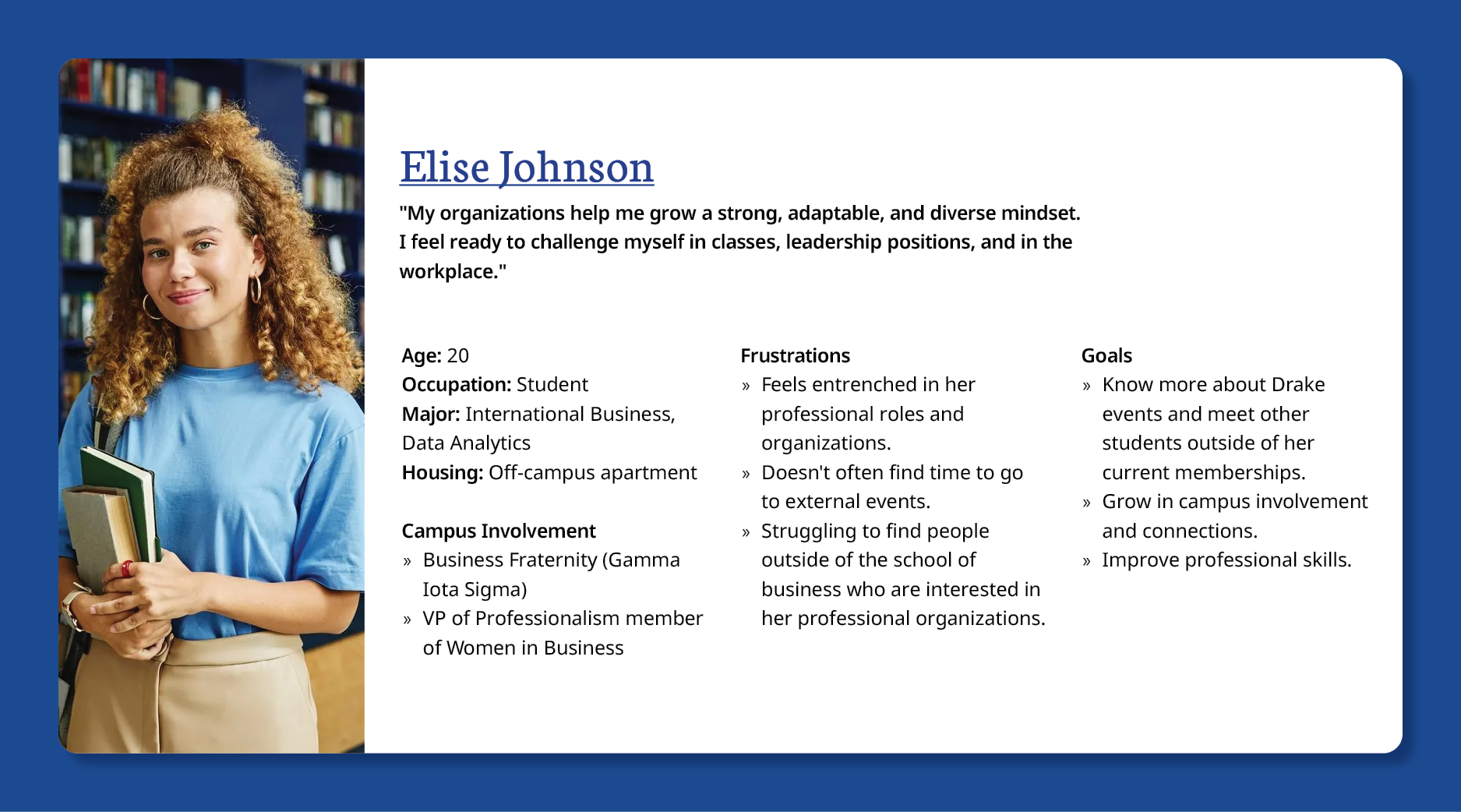
Student Organization leader, the organization perspective.
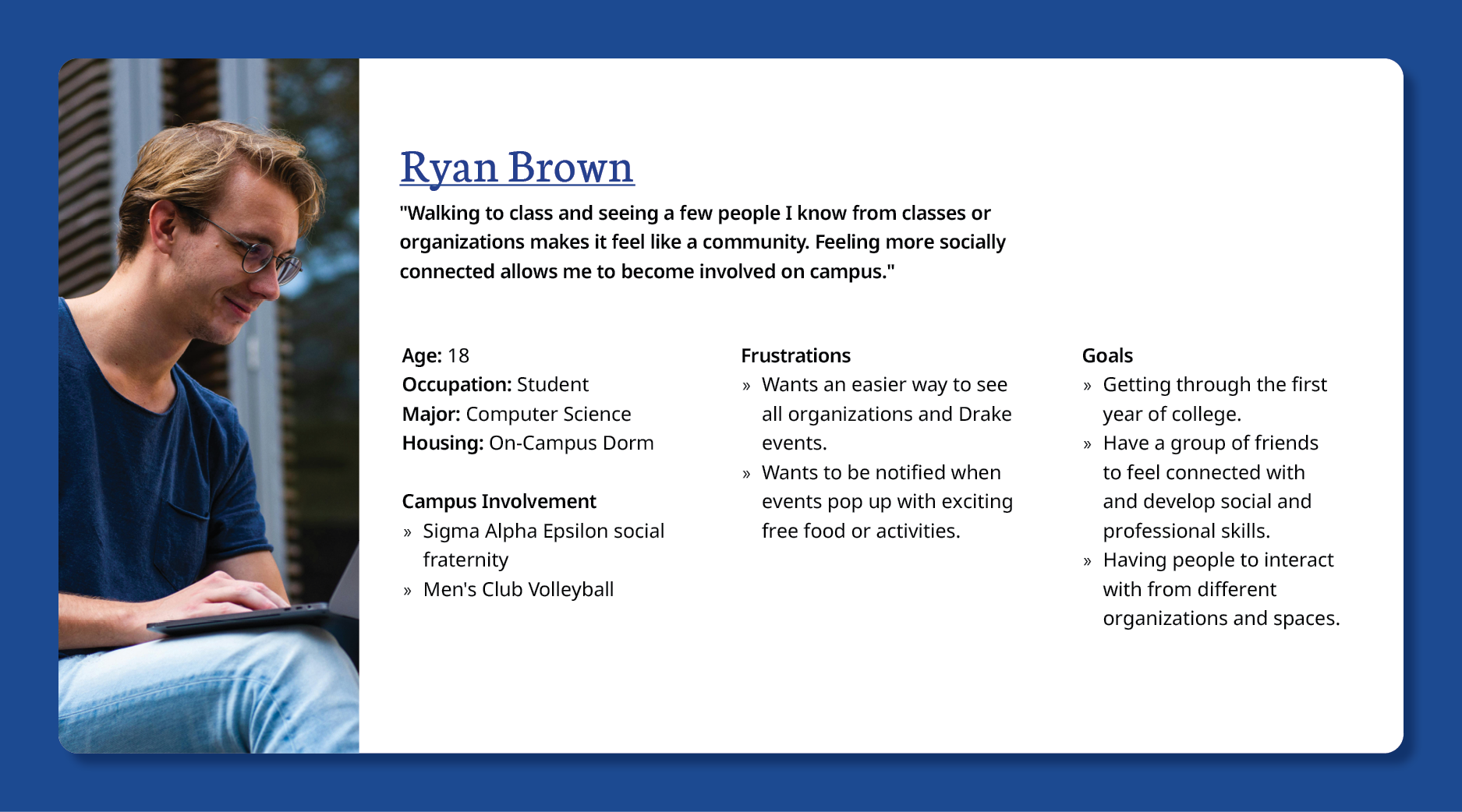
New college student, searching for involvement.
SURVEY
We created a survey to send out to students to gain a better understanding of our user demographics, and their experiences.
Takeaways:
54.1% of respondents live off-campus, while 40.5% live on-campus.
3.38 out of 5 was the average workload reported by respondants.
The average response for campus involvement was 3.16 out of 5.
Two-thirds of respondents utilize Instagram daily to stay connected to students and organizations.
94.1% of student organizations promote themselves on social media.
The majority of respondents said that people not hearing about their events or not being interested in the organization is an issue when it comes to student involvement.
PROBLEM STATEMENT
Drake students do not have a quick and reliable way to find events around campus, making it difficult for them to connect with each other.
STORY BOARDS
To better empathize with our audience we created storyboards to see how the user would interact with our app. We showed how our app would solve the frustrations of the user.
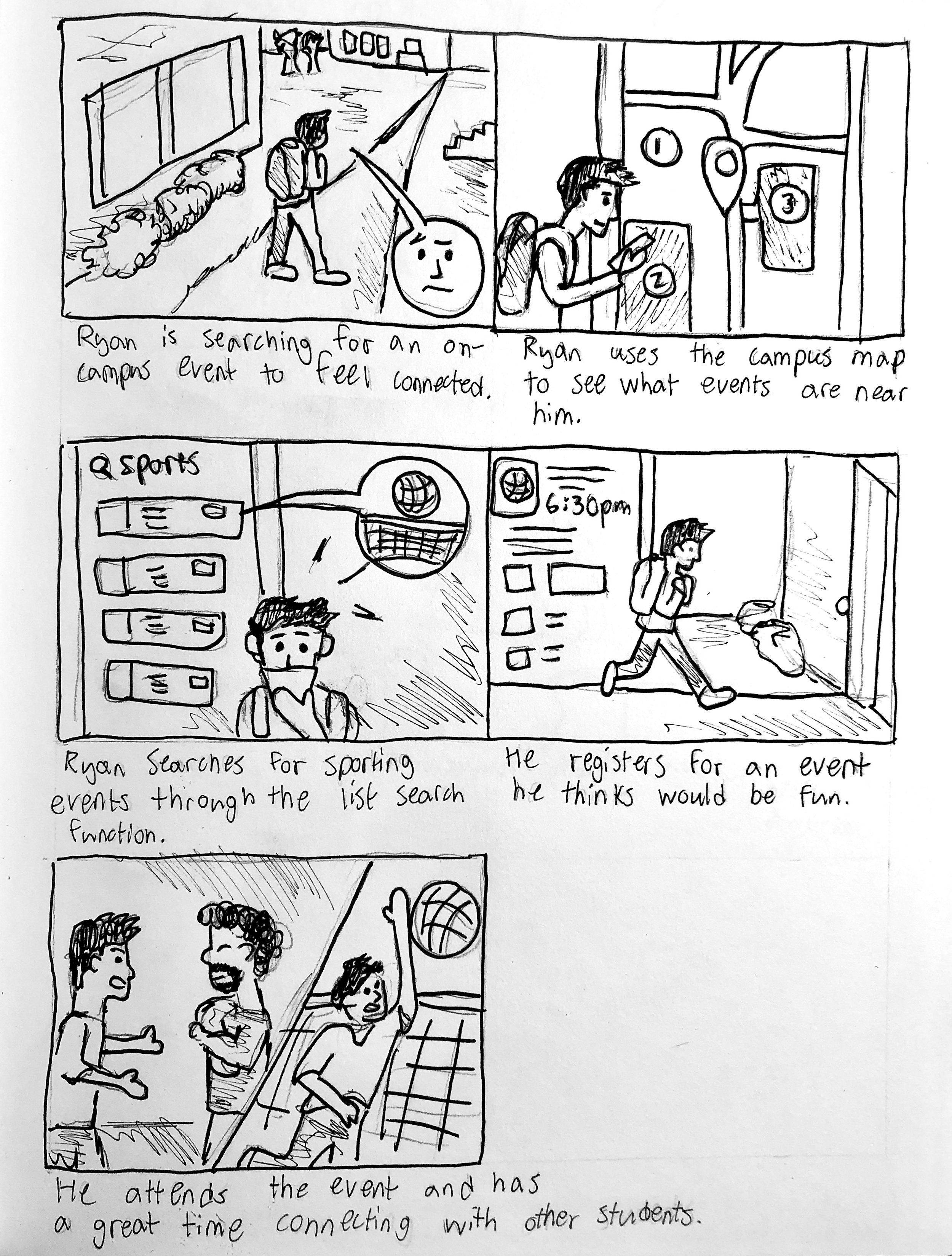
The new student persona has trouble finding involvement on campus.
The application helps the user quickly find organizations and events to attend and gain connections.
HI-FIDELITY PROTOTYPE
Applying feedback from our wireframes, we developed a Hi-fidelity prototype to continue testing finer details of our app. We followed branding guidelines set out by Drake University to ensure our design elements were in accordance with the standards.
User Testing:
To further evaluate our application we completed different user tests and expert reviews to find improvements. We conducted heuristic evaluations and cognitive walkthroughs.
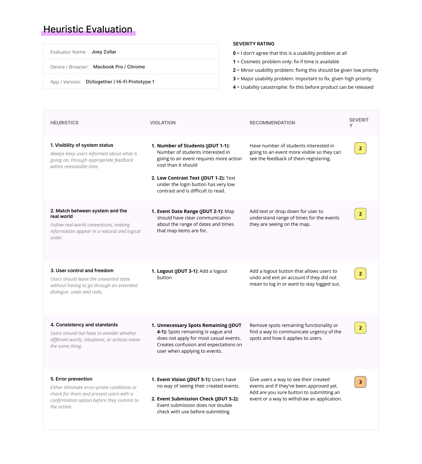
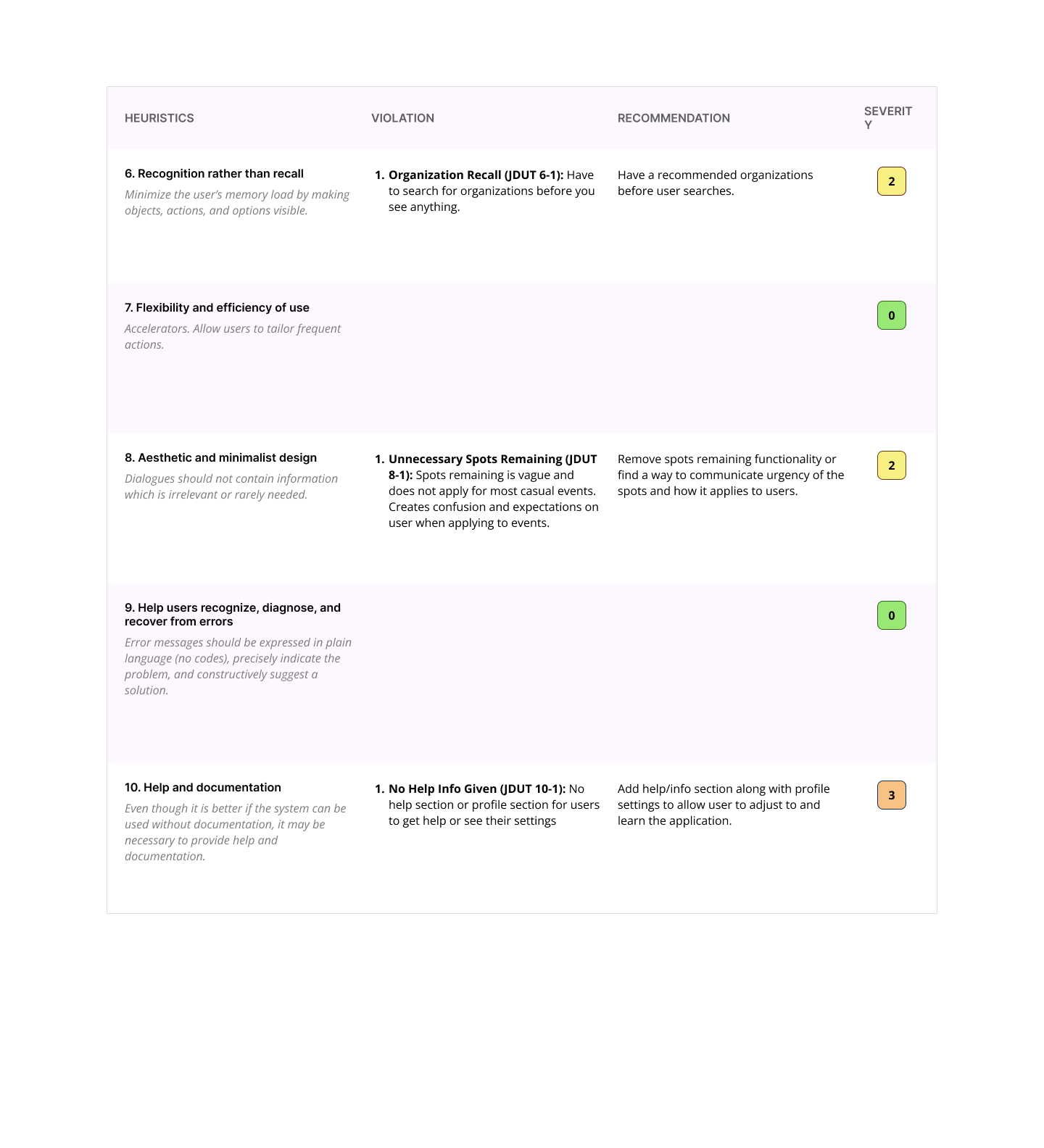
Takeaways:
Ensure information is available and simple to understand for the user.
For the event cards in the events list, information and formatting regarding event duration, spots remaining, and ability to undo registration was unclear.
Poor ease-of-use. Some of the text was difficult to read on the login page, as well as the spots remaining feature mentioned earlier.
The order of the event form submission questions was a bit illogical and the user had no way of seeing what events they may have submitted already.
Improve our user’s ability to find helpful documentation for how to use the app and do a better job at helping the user avoid errors.
WIREFRAMES
We created low-fidelity wireframes of our different screens to begin to organize the flow and functions of our app. We did this to begin getting user feedback as soon as possible on larger scale issues.
User Think-Aloud Evaluations:
With our wireframes we conducted think-aloud user tests to get feedback on our overall app design and layout.
Takeaways:
Refine our homepage and map page to be more clear about the purpose of the sections and how the user needs to interact with it.
Consider the user flow more as well as the hierarchy of information that the user receives.
Refine the user flow to consider what the user’s needs and wants are to make sure that the action cost is lowered for convenience and ease of use.
FINAL PROTOTYPE
Our final version of the prototype applies all of the fixes we decided were necessary and possible within the time frame before project submission.
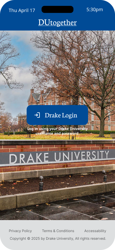
Old login screen had accessibility issues with text legibility.
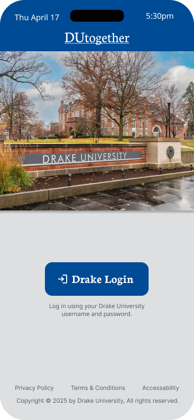
New login screen ensures that text has enough contrast to be accessible.
REFLECTION
This project was a deep dive into the research and development process for creating an app. The focus was to be able to understand the target audience and how to apply their feedback to improve the product. There was always an emphasis on centering the experience on the user and accessibility.