
Bondfire
Music curation and rating social app
Bondfire is a music curation and rating application where users log and curate their music tastes in one place. The app encourages social interaction and connection by allowing users to share logs and create spaces to discuss their shared passion for music.
CHALLENGE
Our group’s goal was to create a interactable application interface based on a gap we found in the current market. We worked through each step of the app design process to gain an understanding of our audience and identify how to improve our product.
My role: Our team had two design students and one journalism student. I led much of the visual branding of the app, along with its interface. I was also involved in other UX developmental aspects of the app.
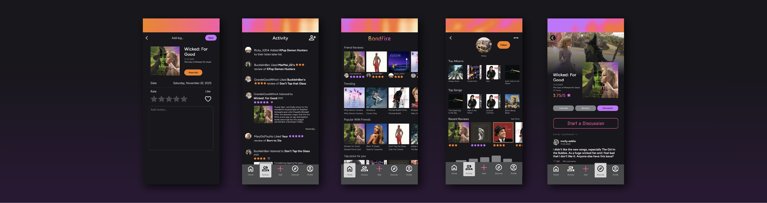
Logging music on the app is simple and intuitive. Users can add a star rating, like, and personalized review.

Finding other users through the friends’ activity page. Having this allows for users to connect and see other’s music tastes quickly.

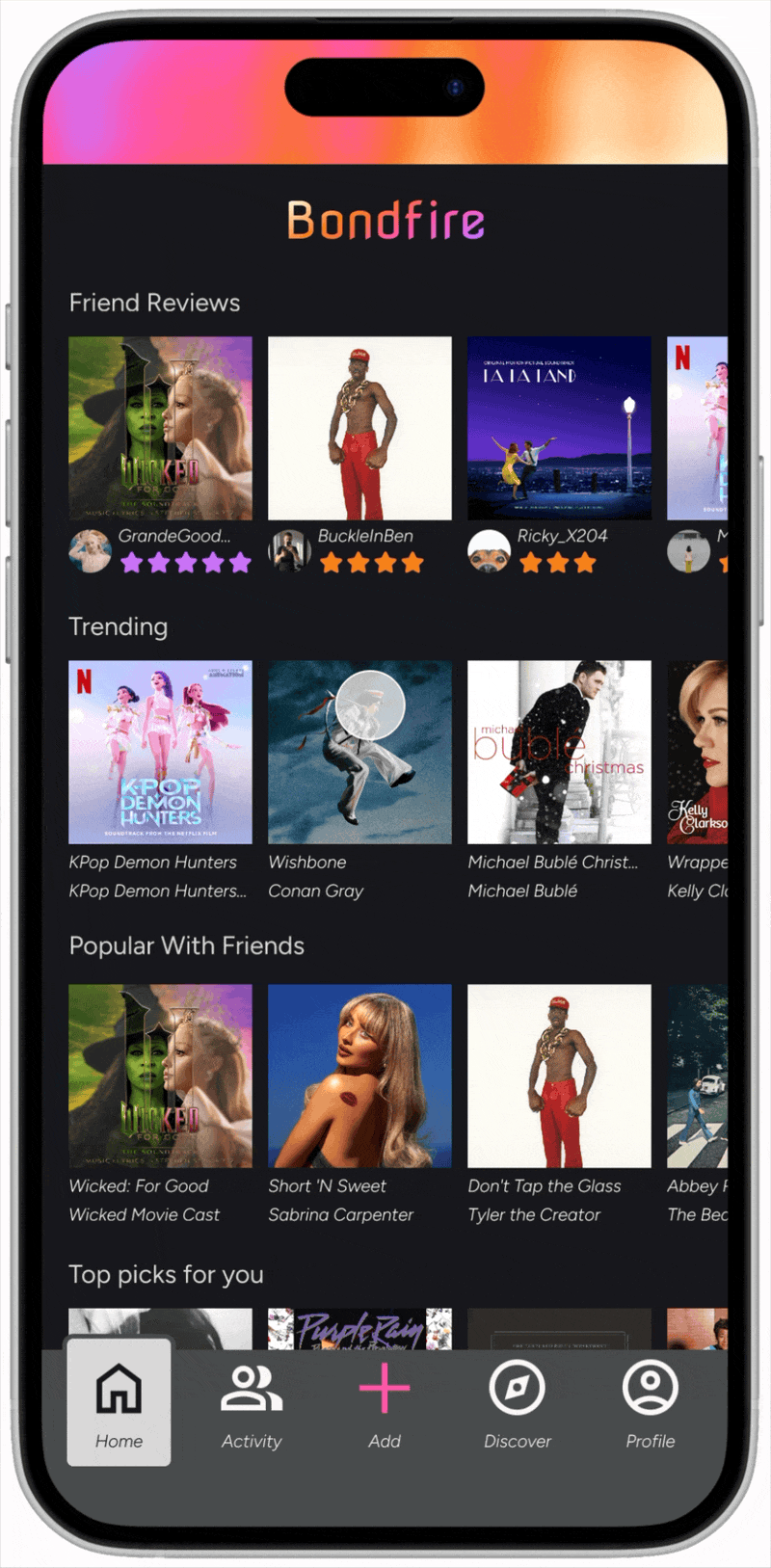
The explore page allows for users to discover new music. The suggestions are based on recent reviews, music popular with friends, or a specific search to see an artist map of similar artists.
USER RESEARCH AND EMPATHIZING
We separated our users into different groups based on what goals they have when interacting with our app.
Target users:
Social music listeners: Users who care what their friends are listening to and enjoy sharing their tastes.
Music curator: Users who enjoy logging and collecting their music tastes in one place to organize their opinions.
Music critics: Users who enjoy rating and critiquing music and engaging in discussion about music topics.
PERSONAS
Using our previously established user groups, we developed user personas to empathize with and base our decisions on.
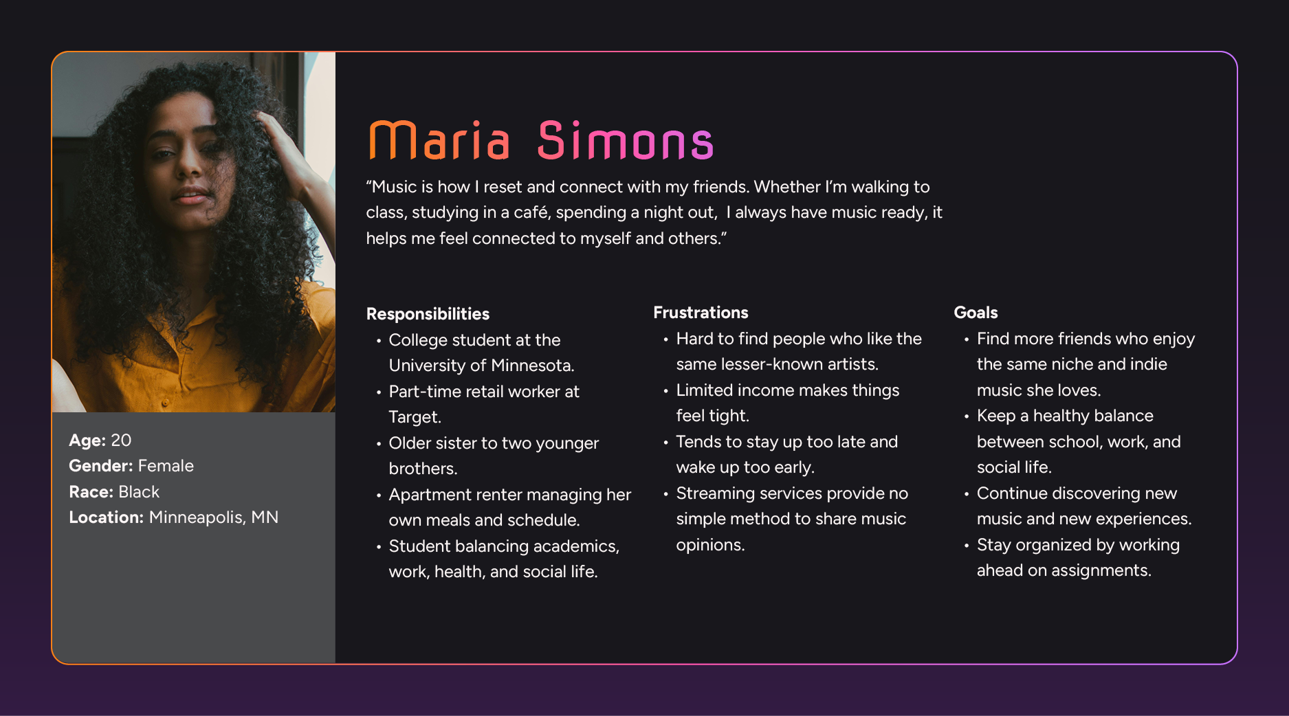
Users who care what their friends are listening to and enjoy sharing their tastes.
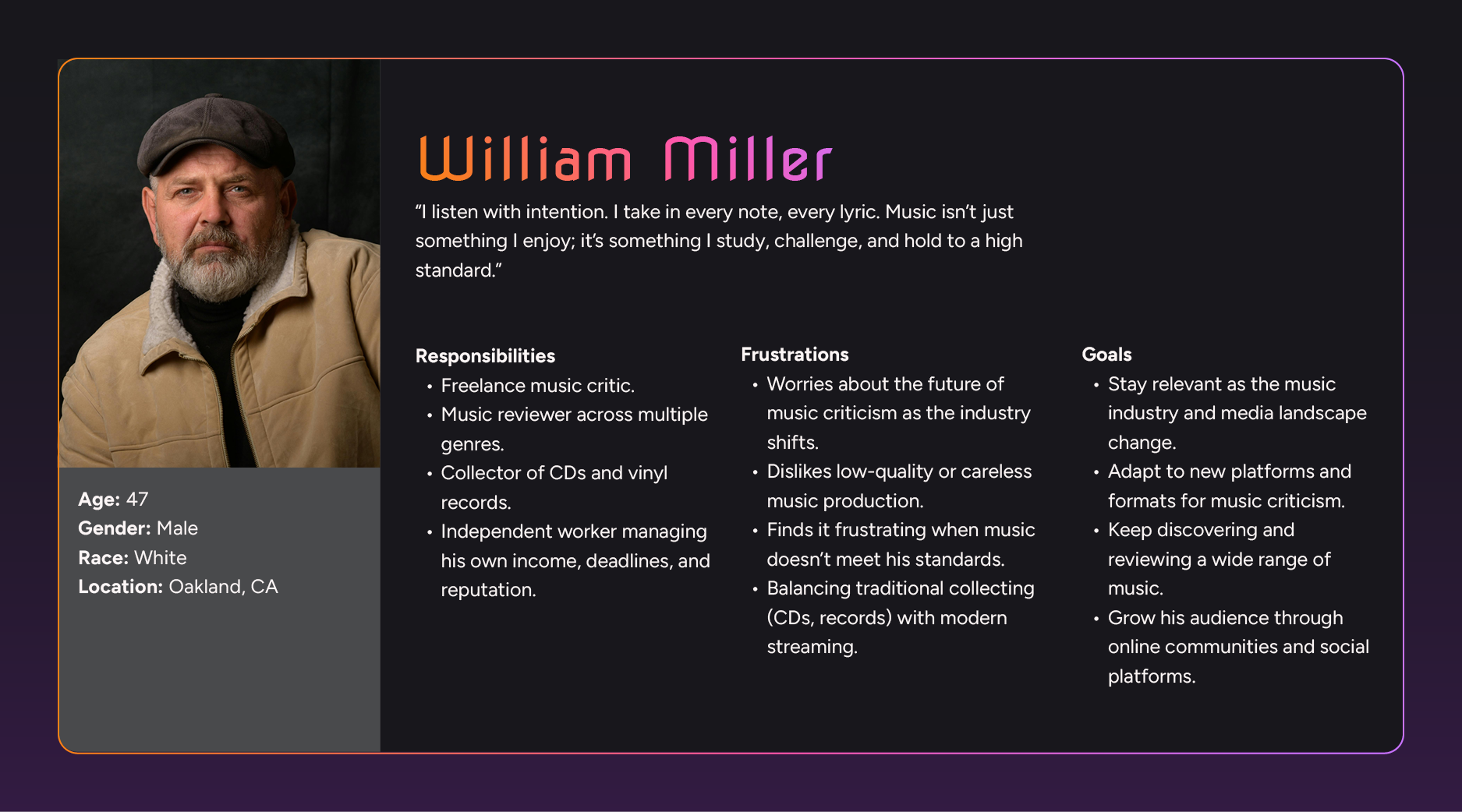
Users who enjoy rating and critiquing music and engaging in discussion about music topics.
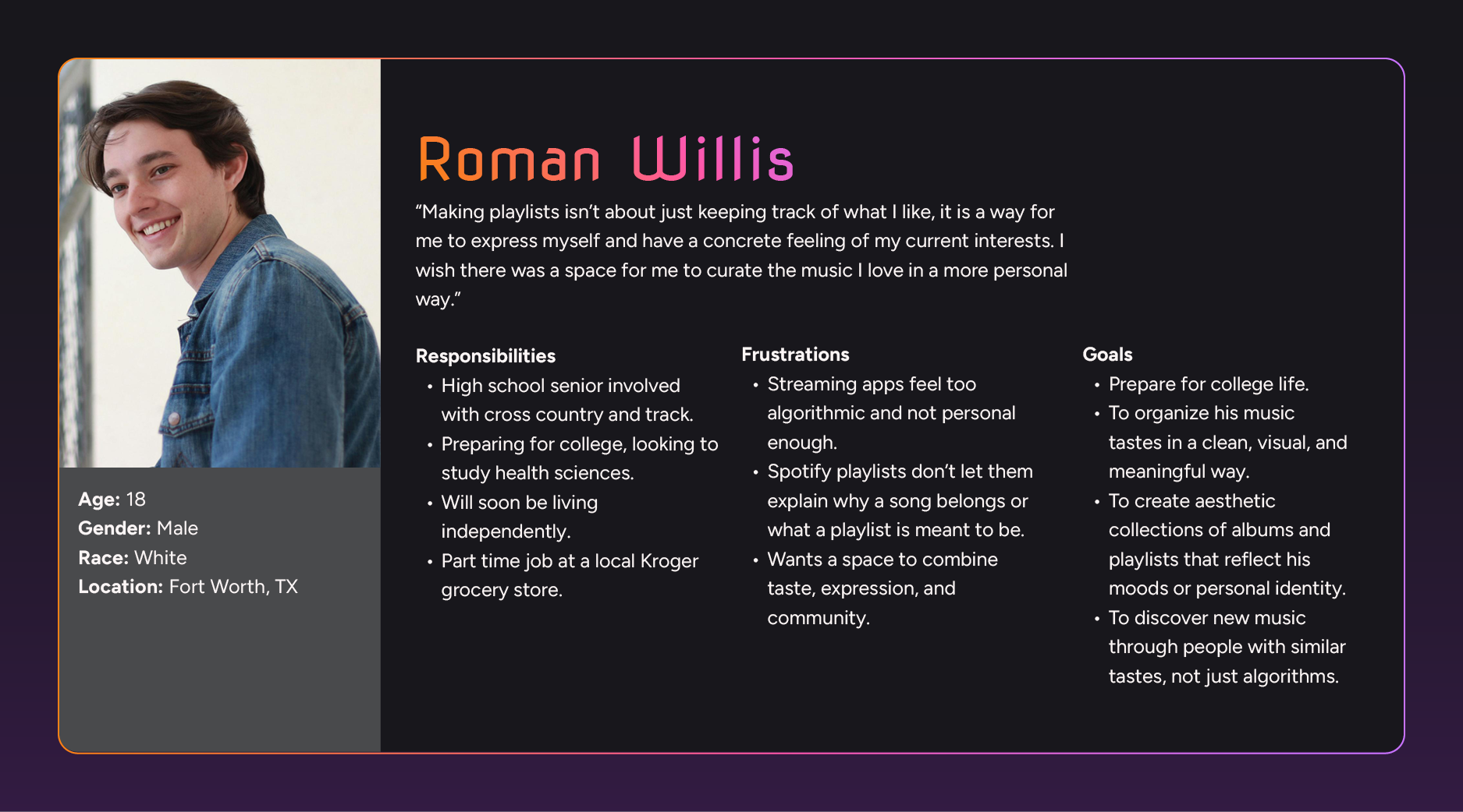
Users who want to have a space to curating and log their music in a personal way.
RESEARCH
Before designing, we focused on understanding our audience how to address their needs.
Competitor Analysis: We found that most competitors only existed as online web pages without in depth social connection systems. This gave us an idea of what new functionality we could bring to the niche.
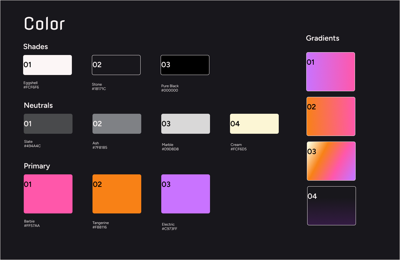
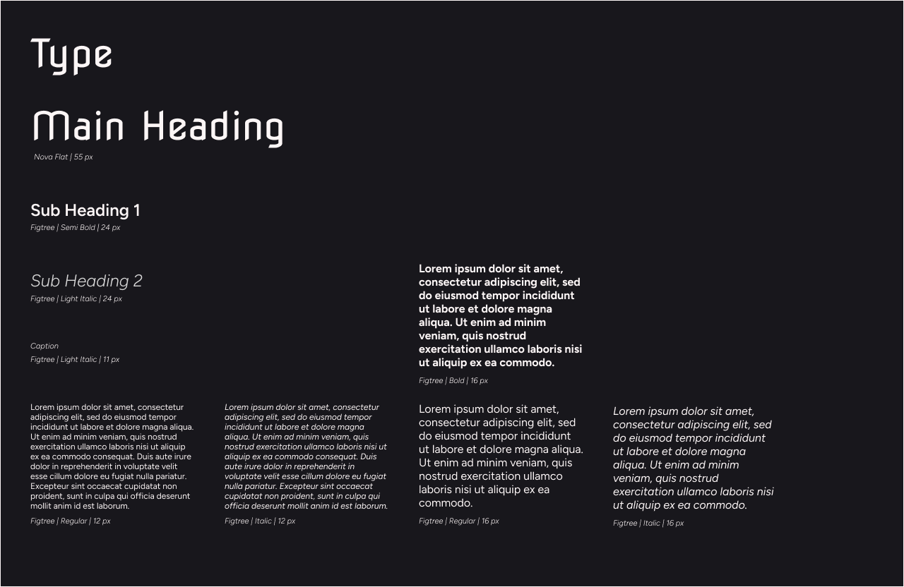
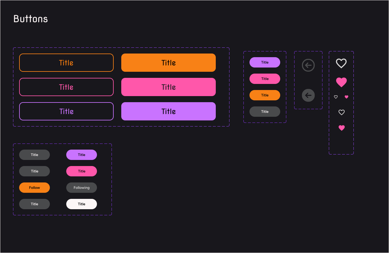
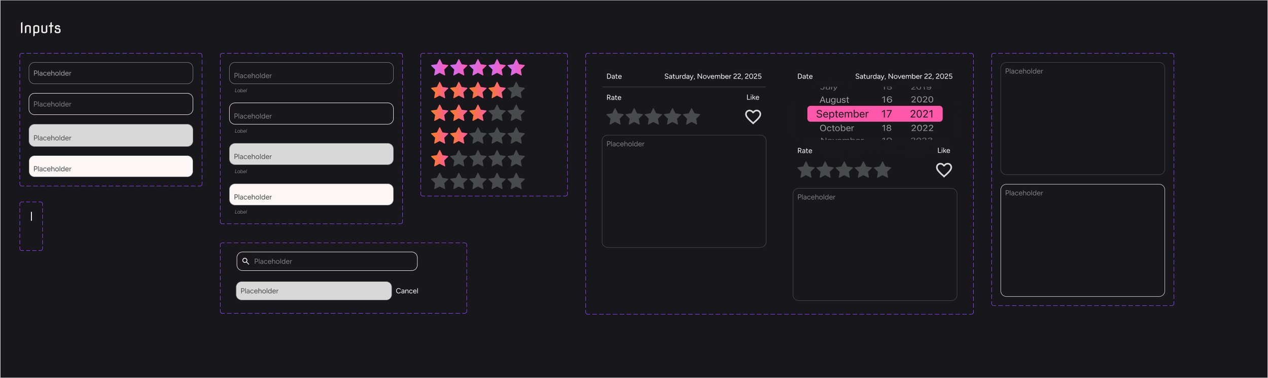
STYLE KIT
Before we began to create a prototype of the application, we developed a detailed style kit with all of our app’s branding components. We focused on being thorough at this stage, creating reusable Figma components, which allowed us to keep our visual style consistent as well as saving us time.
SURVEY
We collected 72 responses from a survey to understand listening habits, goals, and demographics. The results gave us a strong foundation for making informed design decisions.
Takeaways:
Users wanted an easier way to organize their music.
Music discovery through friends was highly valued.
Existing platforms lacked community-focused features.
INTERVIEWS
Each of us found a potential user to understand their current listening and curating methods for music.
Takeaways:
Music is part of everyday life, mostly used while commuting, studying, or working, with streaming as the main method and physical formats (vinyl/CDs) holding emotional value.
Spotify and Apple Music dominate, but users are frustrated by poor shuffle, messy playlist tools, weak discovery, and high cost for students.
New music is found through a mix of friends, social media, concerts, algorithms, and niche sites, with a strong desire for better friend-based discovery.
People want better ways to track, rate, and organize music privately, with simpler and more intuitive interfaces.
VALUE HYPOTHESIS
Bondfire allows users to have a central way to curate and log their music interests while also providing a space to discuss and make connections with others listening to the same music.
MOSCOW LIST
Our MOSCOW list evolved throughout the project as certain functions became more important for our minimum viable product.
Must
Rating an album.
Follow users.
Individual User accounts.
Stats on Profile page.
Discussion space for specific album.
Music recommendation feature.
Should
Rate individual songs.
Create your own list of albums.
Listen later feature.
Being able to share your account/posts.
Could
Critic ratings.
Personalization of background/themes.
Badges or gamified achievements for engagement and discovery streaks.
Won't
Stream music.
Artists won't be able to interact with users.
Direct messaging.
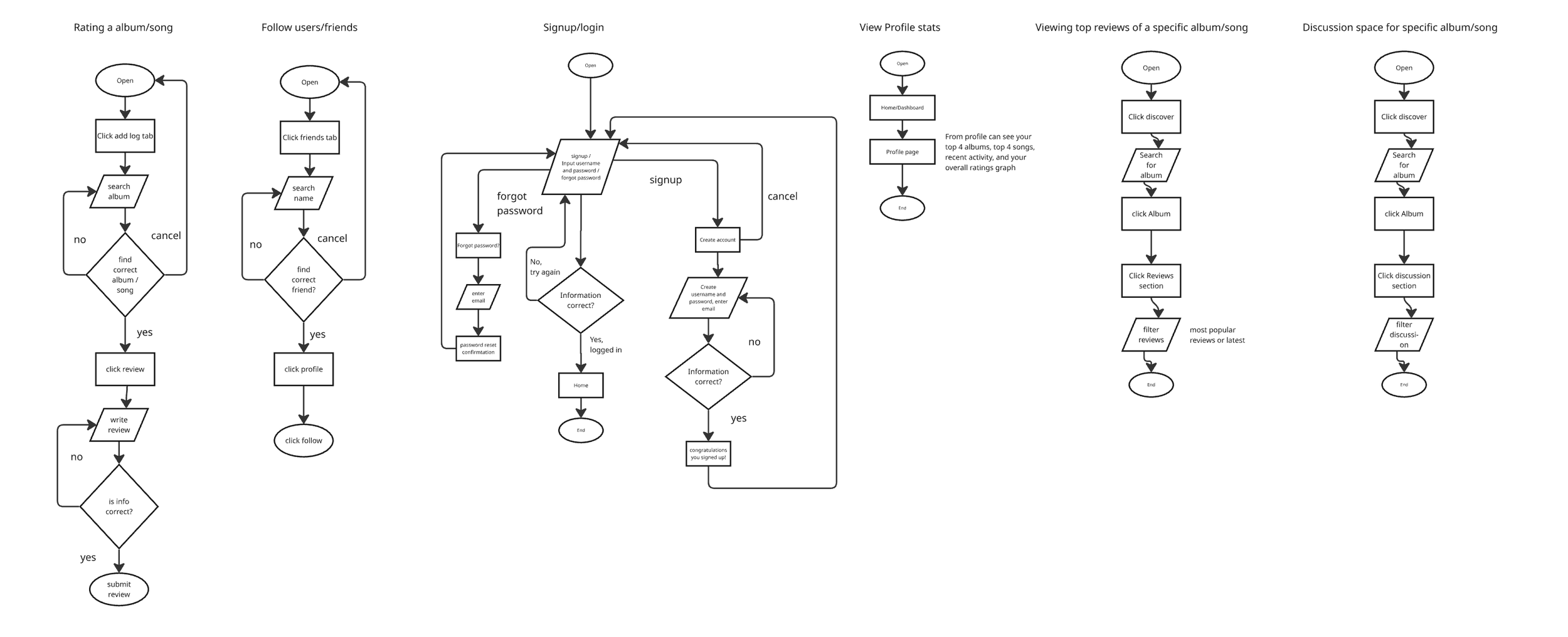
USER FLOWS
With our audience solidified, we began to map out how our users will complete certain tasks of our app, always leading back to the needs of the user.
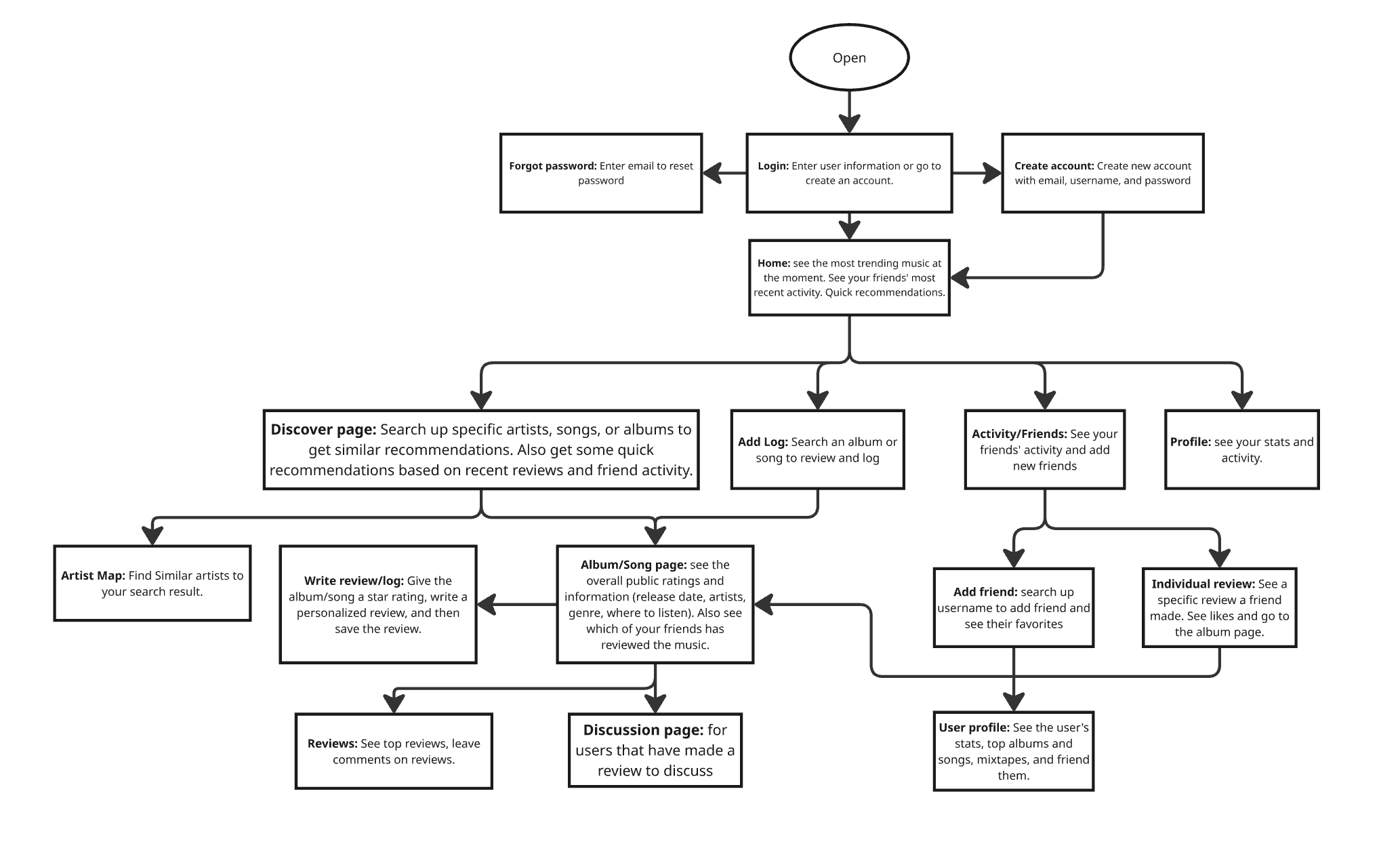
SITE MAP
We furthered out user flows and combined them into a comprehensive site map. This helped us get a complete understanding of our application layout so we could begin to create prototypes.
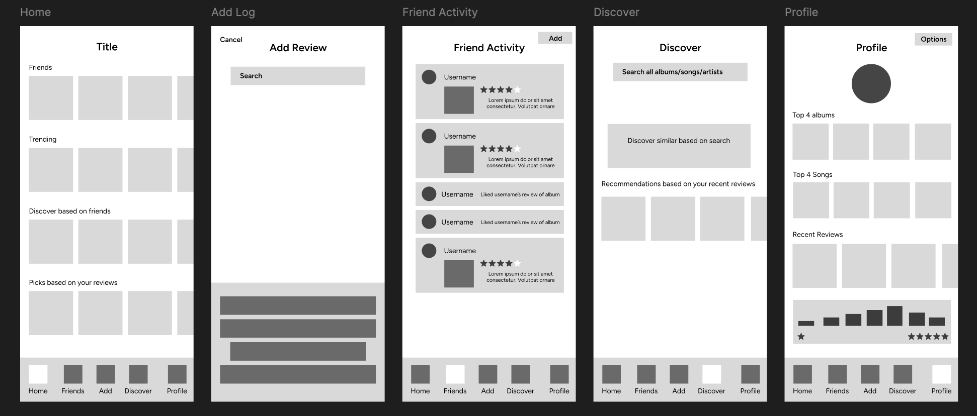
WIREFRAMES
We designed wireframes to start the visual design process for the app. We looked at similar apps such as Letterboxd and Goodreads to get an idea of how other apps organized their interactions.
USER TESTING
After the wireframes we used the elements from our style kit to expand the app to be a high fidelity prototype to test. We tested the prototype with users using think-alouds to get specific feedback from users.
Takeaways:
Clarify login and sign-up flow
Reduce confusion in social features
Improve review and discussion interactions
Strengthen discovery and friend activity
Refine visual design cues
FINAL PROTOTYPE
Given all of the feedback we received, we improved the initial version of the prototype and added the final levels of polish and detail to make it look as finished as possible.
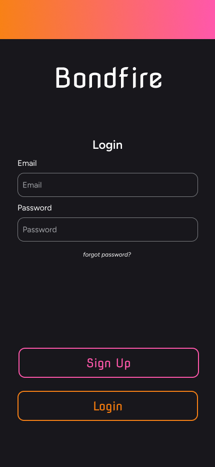
Old login screen that confused users on the intended flow of the app.
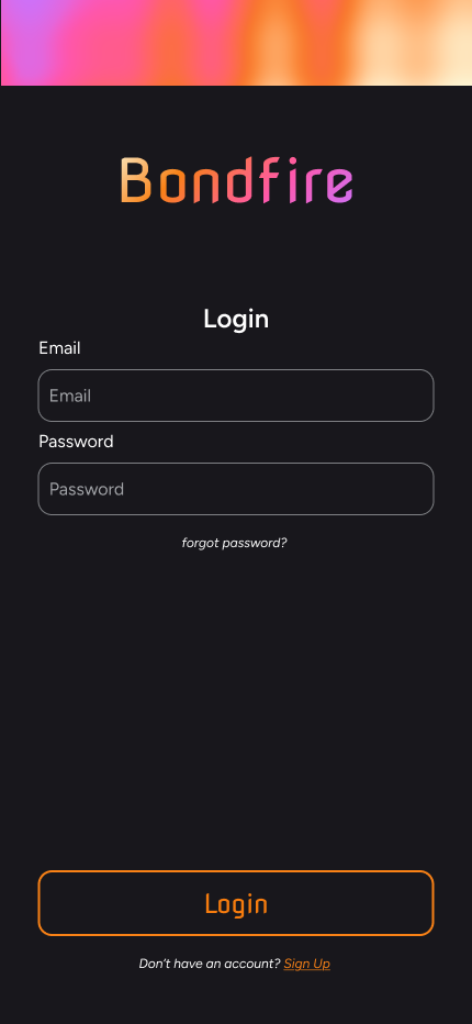
New login with improved branding and visual hierarchy to ensure no confusion for the user.
REFLECTION
This project gave me an in-depth look at the app development process. I had to learn to quickly adapt and stay on schedule to ensure that the product is finished by the deadline. Keeping track of the MOSCOW list was imperative to ensuring that we had a MVP before adding any extra functions. My knowledge of Figma and UX design principals were greatly improved through this process and I am glad of the work my group was able to achieve.